WHAT

WHO

HOW MUCH

HOW

PROGRAM
FINANCING
ABSOLUTE DIMENSIONS
RELATIVE DIMENSIONS
DESIGN STRATEGY

SURFACE EXTENSION

SURFACE REDUCTION

VOLUME EXTENSION

VOLUME REDUCTION

STRUCTURE

MATERIAL

IMAGE

84 PROJECTS

Variation of modes of use: functions, users, schedules, etc.

Relationship between the ownership and the form of the investment that allows the transformation

Variation of the overall dimensions of the building

Proportional relationship between new spaces and existing spaces

Relationship between the structural adjustments and the existing structure

Relationship between the forms and types of pre-existing materials and those of the new intervention

Relationship between the image of the new and the image of the existing (mimesis / contrast)

LOCATION

ALICANTE, SPAIN

ARCHITECTS / FIRM

Juan Carlos Sancho + Sol Madridejos

YEAR

2010

Juan Carlos Sancho + Sol Madridejos – Museum of Contemporary Art in Alicante (MACA)


PROJECT - Main Infos

PROJECT: Juan Carlos Sancho + Sol Madridejos – Museum of Contemporary Art in Alicante (MACA)

LOCATION: ALICANTE, SPAIN

YEAR: 2010

ARCHITECT / FIRM: Juan Carlos Sancho + Sol Madridejos

BUYER: Municipal Housing Patronage (Council of Alicante)

SURFACE: 5.800 sqm

PRICE: € 8.519.546

DESCRIPTION:
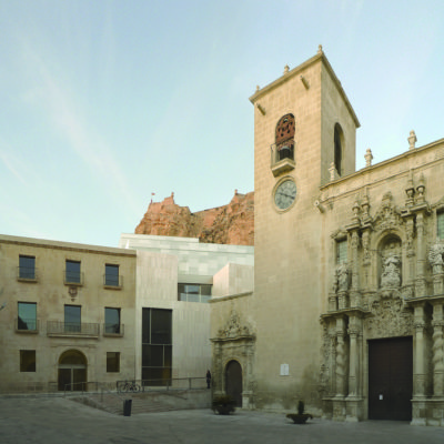
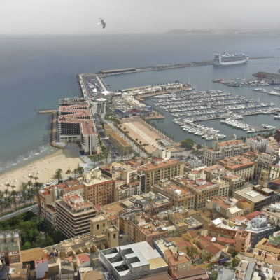
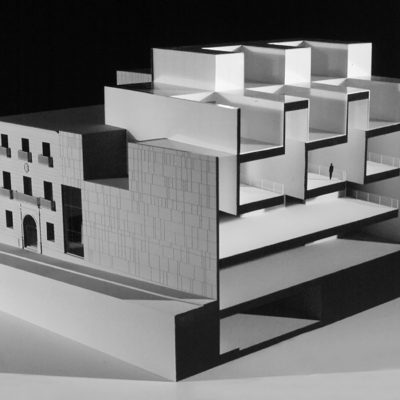
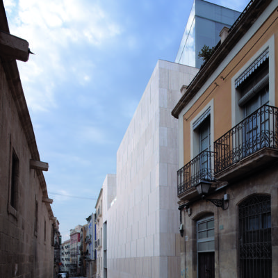
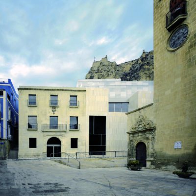
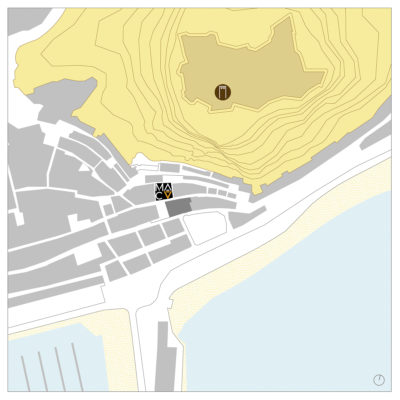
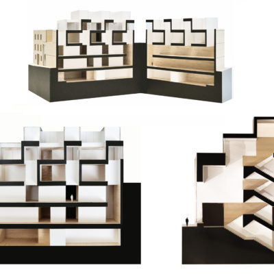
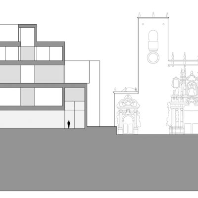
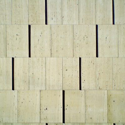
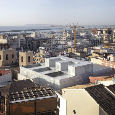
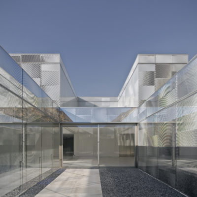
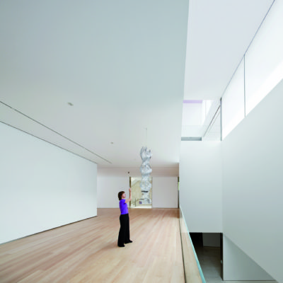
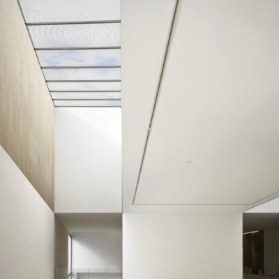
The project emerges from two individual, singular points which propose a well-defined field of work from the outset: - On the one hand, it is a building for an already existing art collection from the 1950s-1970s that includes the pieces donated to the city by the Spanish artist Eduardo Sempere. The collection consists of works from modern artists such as Calder, Vasarely, Chillida, Julio González and Sempere himself. - On the other hand, the reuse of the historical building of La Asegurada and its location within the city centre of Alicante (its slope parameters, its formal language, its context and its orientation), produces a unique atmosphere in the shadow of the Castle, the sea horizon and the proximity of Santa Maria Square and Church. These two starting points (the relation with a realm of artistic and sensorial references together with the context of Alicante’s historical centre) suggest a particular way of understanding and developing the project and its programmatic, spatial and perceptive solution. The use of stone and it closely wall-related condition creates a connection with the conventual language of the adjacent church and the city’s old quarter. At the same time, it contributes to the integration of the ancient La Asegurada building into a single volume, renovating and combining the annexed spaces with the exhibition areas. The stone volume, which absorbs the perimeter slope, is completed by a volumetrically defined vitreous piece. This body is perceptively broken by a double transparent skin that cracks the volume with moiré reflections and games in a language that revives the 1950's and 60's kinetic art. The interior exhibition space is bounded by continuous, diaphanous northern light that enhance three spatial /exhibition situations: - The first horizontal level, in continuity with a rhythm of vertical compressions and dilations. - The second level with its transversal rooms, that relates to the vertical dilations. - Finally, the top floor with its horizontal space, juxtaposed with syncopated vertical and horizontal spaces. This room stitches together three courtyards (black, white and gold) with three perceptive situations related to the optical illusions used by the 1960's kinetic artists. This effect is brought into the outdoor space with changes of scale and references to the place.

WHAT - Program


TOTAL CONSERVATION / CONTINUITY: The functional program remains the original one.

DESCRIPTION:
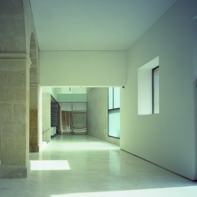
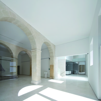
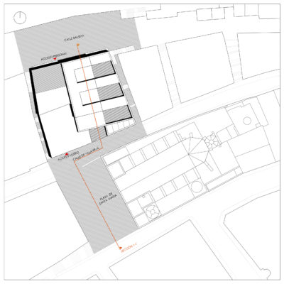
The existing museum is rehabilitated and enlarged, integrating the whole block. The main access is located in the old building, which also holds the visitor reception, the administrative offices and the library. The original diaphanous plans, which had been altered through the years by various additions, are taken back for this purpose. The historical elements are cleaned, restored and consolidated, enhancing them into the free spaces of each floor. The expansion contains exhibition spaces in four different levels, reception areas, work spaces, workshops, storage and a small auditorium. Its setting in a mountainside generates a 9 meters height difference between the northern and the southern façade (the main one). Hence, the expansion is publicly accessed through the old building from Santa Maria Square but the service entry and the loading and unloading area are located two floors above the main access, connecting to the opposite street through the extension.

WHO - Financing


PREVALENT REPLACEMENT / DISCONTINUITY: Financing for a minor part made by the original owner, mostly from another investor.

DESCRIPTION:
The council of Alicante, through the Municipal Housing Patronage, is in charge of the management of the project, thanks to the funding provided by the Community of Valencia.

HOW MUCH - Absolute Dimensions

- SURFACE present EXTENSION,

PREVALENT REPLACEMENT / DISCONTINUITY: The overall dimensions are about three times the pre- existing surface.

- VOLUME present EXTENSION,

PREVALENT REPLACEMENT / DISCONTINUITY: The overall dimensions are about three times the pre- existing volume.

DESCRIPTION:
The existing volume is completed (respecting the compact condition of the historical centre of Alicante), which means an increase of the surface of the museum. The old body has three floors, whereas the expansion reaches three levels above ground level and three underneath. A circulation axis lineally runs through all the floors from the old to the new parts. As a result, the spatial relations observed amongst the exhibition floors generate a unique, completely new space.

HOW MUCH - Relative Dimensions


BALANCE BETWEEN CONSERVATION AND REPLACEMENT: The new spaces are in balance with respect to the pre- existing spaces.

DESCRIPTION:
The spaces of the old volume are restored to their original state, making them ampler and clearer, thus enhancing the historical value of the building. Their use is promoted thanks to the emergence of welcome spaces. These areas complement the new functions placed in the expansion.

HOW - Design Strategy STRUCTURE


PREVALENT CONSERVATION / CONTINUITY: The supporting structure is mainly the original one.

DESCRIPTION:
The old structure is improved with small reinforcement interventions. The new building is conceived as a reinforced concrete structure, both in the perimeter (with a 16 meters height digging) and in the inner exhibition space.

HOW - Design Strategy MATERIAL


BALANCE BETWEEN CONSERVATION AND REPLACEMENT: The materials chosen for the new intervention balance similarities and differences with the existing ones.

DESCRIPTION:
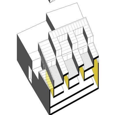
The stone pieces of the façade are maintained. The preserved structural elements are cleaned, consolidated and released to be exempted and exposed. The extension consists of a massive petrous travertine volume that continues the cornice line of the old building and a vitreous volume that overlaps with the previous one and is finished by a double-skin façade made of screen-printed glass. This volume, which can be seen from the mountains, is fully covered by glass, from the façade to the rooftop.

HOW - Design Strategy IMAGE


PREVALENT CONSERVATION / CONTINUITY: The new intervention favors a relationship of continuity with the existing structures.

DESCRIPTION:
The Project is defined as the combination of two pieces: 1. The massive stone volume, that fills the block till the edge of the cornice of the existent building and relates to the scale of the immediate surroundings. 2. The glass volume that is overlapped and related to the background mountains, the view from the path that climbs to the castle, the movement, the reflections, the light…