WHAT

WHO

HOW MUCH

HOW

PROGRAM
FINANCING
ABSOLUTE DIMENSIONS
RELATIVE DIMENSIONS
DESIGN STRATEGY

SURFACE EXTENSION

SURFACE REDUCTION

VOLUME EXTENSION

VOLUME REDUCTION

STRUCTURE

MATERIAL

IMAGE

84 PROJECTS

Variation of modes of use: functions, users, schedules, etc.

Relationship between the ownership and the form of the investment that allows the transformation

Variation of the overall dimensions of the building

Proportional relationship between new spaces and existing spaces

Relationship between the structural adjustments and the existing structure

Relationship between the forms and types of pre-existing materials and those of the new intervention

Relationship between the image of the new and the image of the existing (mimesis / contrast)

LOCATION

Barcelona, Spain

ARCHITECTS / FIRM

LoCa Studio Daniel Lorenzo - Carlota Casanova

YEAR

2018

LoCa Studio – LoCa Office


PROJECT - Main Infos

PROJECT: LoCa Studio – LoCa Office

LOCATION: Barcelona, Spain

YEAR: 2018

ARCHITECT / FIRM: LoCa Studio Daniel Lorenzo - Carlota Casanova

BUYER: LoCa Studio

SURFACE: 130 sqm

PRICE: € 43.000

DESCRIPTION:
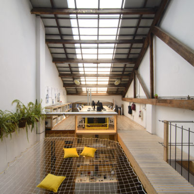
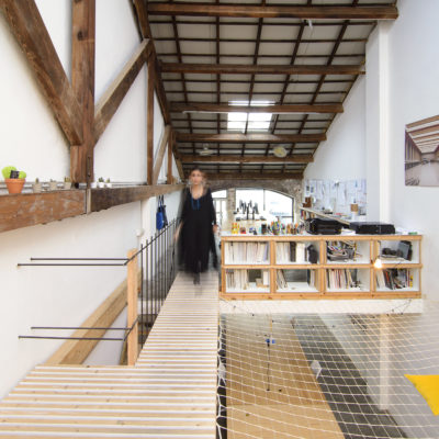
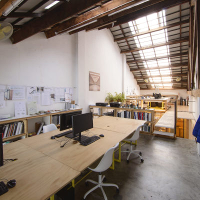
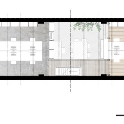
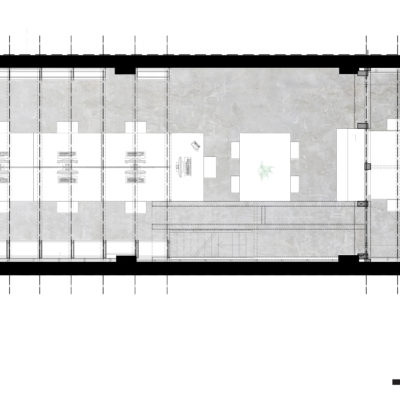
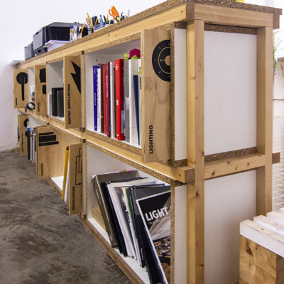
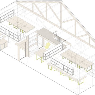
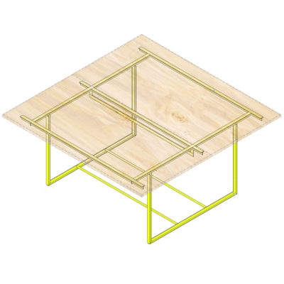
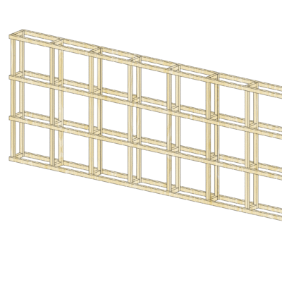
LoCa Studio is locate in a fantastic space in one of the Barcelona centres, next to Plaza de España. The office is in an industrial warehouse that served the first Feria de Barcelona (Barcelona Fair), build for the International Exhibition of 1929. The old industrial warehouse was shifted later to storages and today has become a complex of galleries and studios focus on art and design. One of this spaces is occupied by LoCa Studio, a little industrial building of 9m height with two mezzanine floors on the extremes that left free the middle and higher space. The work of renovation and transformation, from its previous use as a storage, was: reconnecting the mezzanines, promote the entrance of natural light inside and kept the proportions of the original industrial space. To succeed on this, the original container was freed taking out the original tiny distribution, the workplaces were set, the mezzanines were connected through a bridge, the façade was open taking advantage of an existing arc in the wall, a meeting room was organized downstairs in the back to capitalize its natural protection and quiet, and furniture was produced according for works in the Studio. Works of distribution and furniture were realized mostly by two craftmen: the blacksmith and the carpenter with whom hybrid solutions were shaped. Likewise, construction elements were minimized to ease construction and reduce costs. Those were limited to: T metal profile of 40mm, wooden profile of 45mm, white melamine no treated edge of 22mm and birch plywood of 22mm. The result is a confortable and wide space that promote collaboration and work betwenn the members of the studio. The use of the mezzanines and the organization of the workstations make possible dive the team in groups and activities. In the other hand, the bridge, the doble height and the resting net generates a meeting space always present. A central space that due its proportions and the reduced number of members in the team, promotes the good feeling and a family feeling and close, which is the company’s core.

WHAT - Program


TOTAL REPLACEMENT / DISCONTINUITY: The new functional program has completely replaced the original one.

DESCRIPTION:
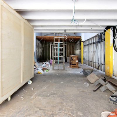
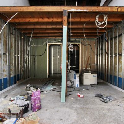
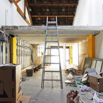
For many years the complex call "Espai Serrahima" was almost abandoned after years being used only for storage. Previously was serving as workshops for the Barcelona Fair located behind walls, but once the Fair was moved to the borders of Barcelona, the activity in the warehouses lack of sense. At the time we rent the space was in a bad conservation state. Our work was to clean up the space, at take advantage of the original structure and the wooden structures that were added later, while making possible the new planned activity.

WHO - Financing


TOTAL REPLACEMENT / DISCONTINUITY: Financing made entirely by an investor other than property.

DESCRIPTION:
Espai Serrahima, the old industrial area were the office is located is still owned by a family. The warehouses and spaces are rented.

HOW MUCH - Absolute Dimensions

- SURFACE present EXTENSION,

PREVALENT CONSERVATION / CONTINUITY: The overall dimensions increase moderately with respect to the pre-existing surface.

- VOLUME present NO VARIATION,

TOTAL CONSERVATION / CONTINUITY: The overall dimensions are equal to the pre-existing volume.

DESCRIPTION:
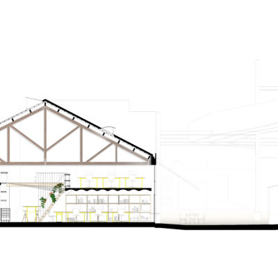
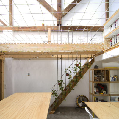
The volume of the warehouse was not modified. The roof was subtituted by a new technical solution to warranty isolation and waterproofing. This action was taken by the owners and affect to all the warehouses in the complex. The inside was not modified. Slabs were already in place. Only a gateway was added to connect both mezanines.

HOW MUCH - Relative Dimensions


TOTAL CONSERVATION / CONTINUITY: There are no new spaces.

DESCRIPTION:
The original section was preserved, while the roof was modified by the owners. It had leaks and multiple overlaped repairs. The inside space was clean up of the multiple temporary subdivisions added for previous users and slabs were preserved. To link the slabs which were at different level, a bridge was build between the two platforms.

HOW - Design Strategy STRUCTURE


PREVALENT CONSERVATION / CONTINUITY: The supporting structure is mainly the original one.

DESCRIPTION:
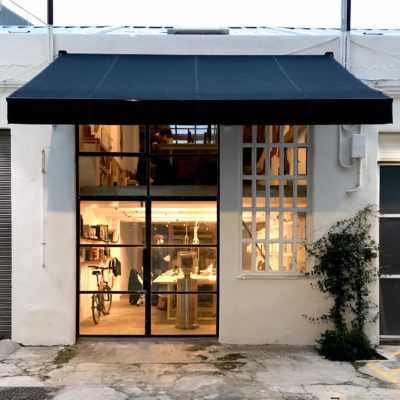
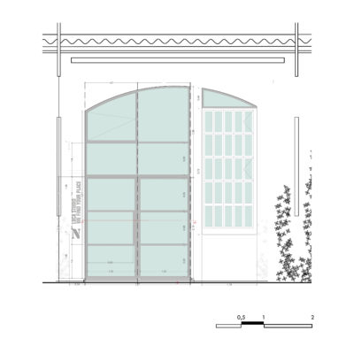
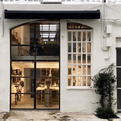
The structure was not modified except the entrance of the warehouse and the path or bridge between the original levels - mezzanines. The façada was previously operating with a garage door that required to build right angles. We found that the opening was originally supported by and arch, and it was decided to recover partially the initial structure. For this reason, the door is an arch in its upper part. The empty space facilitate, once clean up, make possible the new activity without modifying the original space.

HOW - Design Strategy MATERIAL


BALANCE BETWEEN CONSERVATION AND REPLACEMENT: The materials chosen for the new intervention balance similarities and differences with the existing ones.

DESCRIPTION:
The original materials used for the construction and finishing of the warehouse were plaster for the walls and timber and also ceramic roof tiles. The tiles were removed by the owners at the time that we were doing the inside renovation and while a different solution was proposed for the cover of the roof, they decided to install sandwich panels with coated aluminium finishing. For the rest of the intervention, the materials used were: spruce plywood, white finishing plywood , wooden beams and wooden profiles, steel profiles and transparent glass. With those elements all the furniture and divisions were build.

HOW - Design Strategy IMAGE


BALANCE BETWEEN CONSERVATION AND REPLACEMENT: The new intervention balances elements of continuity and discontinuity with respect to existing structures.

DESCRIPTION:
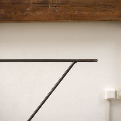
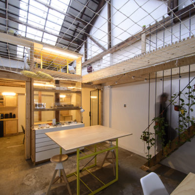
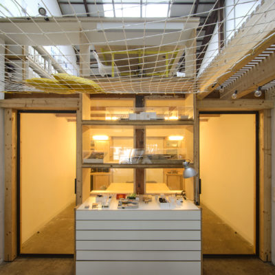
Once the decition of keeping the mezzanines was taken, and the space was empty, the work was on adapting the space to the new use. Dimensions easily fit. Following the power given by the original wooden beam in place supported in the center by a steel hook, we decided to work with the same elements as additions in an open dialogue with the existing elements. The original floor was also kept once polished and repaired, as a memory of the old activities and agregations over time. At any time was the intention of merging original structures and new ones in a mimetic continuity, rather it was the will of recognizing the values of the aditions, the parts that are naturally merge.