WHAT

WHO

HOW MUCH

HOW

PROGRAM
FINANCING
ABSOLUTE DIMENSIONS
RELATIVE DIMENSIONS
DESIGN STRATEGY

SURFACE EXTENSION

SURFACE REDUCTION

VOLUME EXTENSION

VOLUME REDUCTION

STRUCTURE

MATERIAL

IMAGE

84 PROJECTS

Variation of modes of use: functions, users, schedules, etc.

Relationship between the ownership and the form of the investment that allows the transformation

Variation of the overall dimensions of the building

Proportional relationship between new spaces and existing spaces

Relationship between the structural adjustments and the existing structure

Relationship between the forms and types of pre-existing materials and those of the new intervention

Relationship between the image of the new and the image of the existing (mimesis / contrast)

LOCATION

Reggio Emilia

ARCHITECTS / FIRM

Laboratorio di Architettura Architetti Associati + Arch. Emilia Lampanti

YEAR

2011

Laboratorio di Architettura Architetti Associati – Brennone 21


PROJECT - Main Infos

PROJECT: Laboratorio di Architettura Architetti Associati – Brennone 21

LOCATION: Reggio Emilia

YEAR: 2011

ARCHITECT / FIRM: Laboratorio di Architettura Architetti Associati + Arch. Emilia Lampanti

BUYER: Private funds

SURFACE: 434 sqm

PRICE: € 265.000,00

DESCRIPTION:
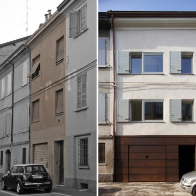
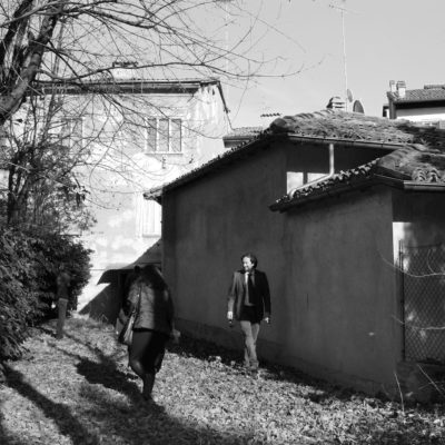
Brennone21 is a real example of experimentation on the zero-emission recovery of the historical city. A terraced building type with high depth in the historical city centre of Reggio Emilia, occupied by two residential units and two areas allocate to the tertiary sector, is the set of a series of typological and energy recovery interventions that will lead the building to cancel the emission of greenhouse gases into the atmosphere (Carbon Zero). The building recovery aims on the correct perception of the building type: the interior spaces are wide, flexible and bright, the existing inner courtyard is restored brought to life on t in its original conformation, the rear garden designed as an extension of the interior spaces, the common staircase takes shape and dimensions characteristic of the building type, opening onto the inner courtyard as well as in many city typologies. Building from the erased history, Brennone 21, shows its new image on the city route in a very discreet manner that allows a horizontal reading of the building: a ground floor intended as garage and a pedestrian entrance entirely covered with corten steel plates is opposed to two living levels treated with thermos -plaster render in soft colours and openings that try to rethink the scanning of the openings of the entire block, improving the quality of lighting and solar contribution of the interior spaces. From the entrance hall it is possible to read the building in all its development up to the rear garden while the open staircase on the small inner courtyard expands the perception of space and allows access to the units.

WHAT - Program


BALANCE BETWEEN CONSERVATION AND REPLACEMENT: The new program is in balance with the existing one.

DESCRIPTION:
The project involves the typological and energy recovery of a typical terraced building located in the historical city centre of Reggio Emilia. The functional program, in partial continuity with the previous residential and commercial uses, consider the inclusion of two residential units and two spaces intended for tertiary sector.

WHO - Financing


TOTAL REPLACEMENT / DISCONTINUITY: Financing made entirely by an investor other than property.

DESCRIPTION:
The intervention was totally funded by private subjects, who purchased the building from the previous owners with the aim of recovering it.

HOW MUCH - Absolute Dimensions

- SURFACE present REDUCTION,

PREVALENT CONSERVATION / CONTINUITY: The overall dimensions decrease moderately with respect to the pre-existing surface.

- VOLUME present REDUCTION,

PREVALENT CONSERVATION / CONTINUITY: The overall dimensions decrease moderately with respect to the pre-existing volume.

DESCRIPTION:
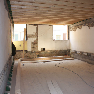
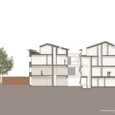
The slabs of the three levels above ground and the roof, to meet the requirements of the new Seismic Regulations and lighten the permanent loads, have been demolished and replaced by new timber slabs that are connected with appropriate measures to the preserved and restored external masonry. The inner courtyard has been clear from the previous covering on the ground floor, reducing the surface and the total volume existing before the intervention.

HOW MUCH - Relative Dimensions


TOTAL REPLACEMENT / DISCONTINUITY: The new spaces have completely replaced the existing spaces.

DESCRIPTION:
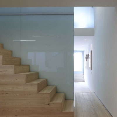
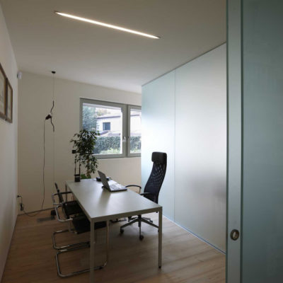
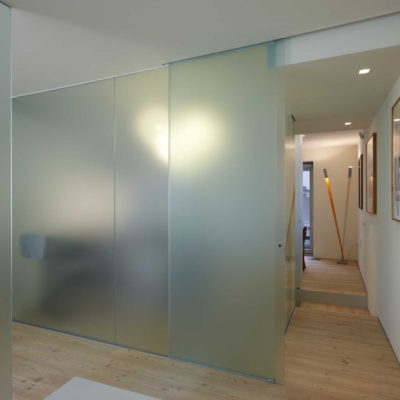
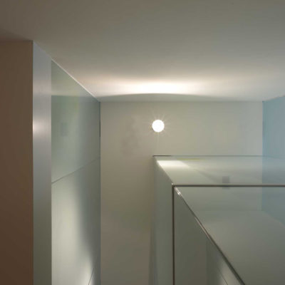
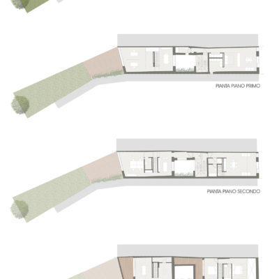
The intervention led to the complete redistribution of the interior spaces, made wide and flexible. On the ground floor there is a garage and three cellars facing the public road and part of it is a professional studio in the building part facing the garden. The last one is on two levels with an internal connecting staircase. The common staircase lead to the first level to a housing unit for one / two people and to the second level to another housing unit for three people, on the street front arranged on two levels. Another professional studio also partially arranged on two levels, in the body on the garden. The interior spaces are characterized by service blocks (bathrooms, closets, kitchenettes etc.) located in the middle of the building and in direct contact with plant cavities that delimit the remaining spaces, reducing internal partitions.

HOW - Design Strategy STRUCTURE


PREVALENT REPLACEMENT / DISCONTINUITY: The supporting structure is predominantly a new structure.

DESCRIPTION:
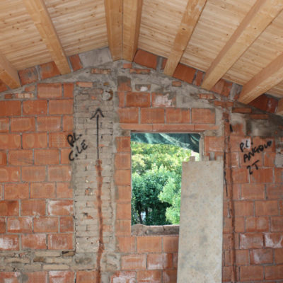
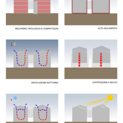
The existing building envelope is integrated with the new structure realized with a dry technology : Slabs and roof have a timber structure connected to the existing masonry structure with all the proper device ensuring the respect of the seismic law for the lightening of the permanent load. Meanwhile the inside wall are realized with the acoustic insulated drywall or/and glass. The dry technology allow to reduce the energetic consumption in the production and construction stage, reduce the construction timing and represent a construction streamlining in the case of challenging and complex work like in the case of the intervention inside the historical city centre.

HOW - Design Strategy MATERIAL


PREVALENT REPLACEMENT / DISCONTINUITY: The materials chosen for the new intervention show more differences than similarities compared to the pre-existing.

DESCRIPTION:
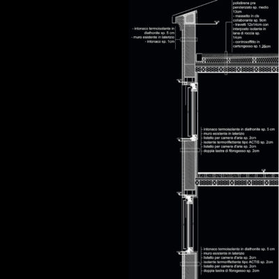
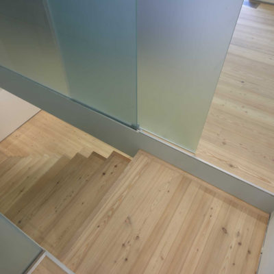
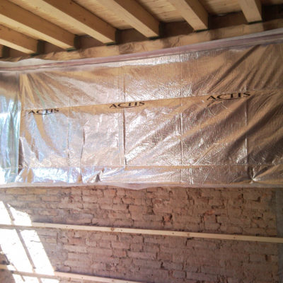
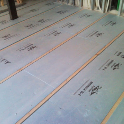
The choice of the dry construction system has led to the use of materials inside the building that are different from the existing ones: structural parts in timber, internal partitions in plasterboard or glass and wooden floors. As regards the energy recovery of the external walls in existing bricks, a double insulation system was also used: a slight external insulation made with a thin plaster (4 cm) based on lime and cork with a function of reducing thermal bridges and an internal insulation with a thin heat-reflecting insulator that works mainly on by irradiation. The roof is insulated with a total of 22 cm of wood fiber added to a reflective sheath , combined with a ventilation system made under the mantle in brick tiles, to improve the summer comfort of the interior spaces. To minimize the increase in the roofing system and make the insulation less visible from the inside, the wood fiber insulation is made partially on the roof’s intrados between the wooden joists and the false ceiling made by plasterboard, obtaining a transmittance about 0.09 W / mqK. To complete the homogeneity of insulation of the heated casing, the floor on the ground is insulated with 20 cm of polystyrene, the floor on the unheated portions is insulated with thin thermos-reflective insulators and all the fixtures are made of triple lacquered fir wood low-emission glass with argon gas, capable of guaranteeing a Uw ≤ 1.00 W / mqk.

HOW - Design Strategy IMAGE


BALANCE BETWEEN CONSERVATION AND REPLACEMENT: The new intervention balances elements of continuity and discontinuity with respect to existing structures.

DESCRIPTION:
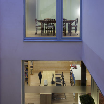
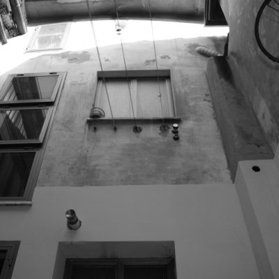
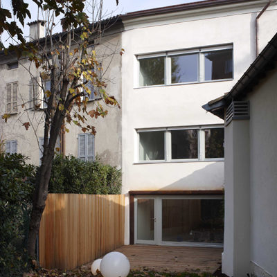
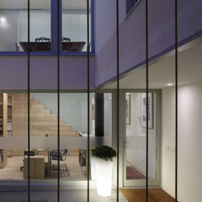
The new image of the building on the street allows a horizontal reading of the façade: a ground floor intended to a garage and a pedestrian entrance covered with corten steel slabs oppose with the two living levels treated with thermo plaster render in soft colours . The openings reinterpret the scan of the openings of the entire front of the urban block, and, at the same time, improve the quality of lighting and solar contribution inside the interior spaces. Two sided openings with a rectangular starched shape with same proportions as those of the entire street, equipped with blinds with full louver, design the front, while a glazed opening coplanar with the outer edge of the facade seeks differentiation with the two abovementioned openings. The horizontal compositional principle returns to the internal fronts and to the garden, but here the openings, free from the relationship of the surrounded buildings making up the urban block, acquire wider proportions, always respecting the balance of the facade, to increase the level of natural lighting made more difficult by the modest proportions of the courtyard and by the north-west exposure of the garden. The inner courtyard, which is reached through a narrow entrance hall treated as a path and paved with concrete, becomes a type of garden: on two sides evergreen climbing on steel wires shielded the southern boundary wall and delimit the open space of the stairway to east, while the other two sides have asymmetrical composition openings linked to each other by a different treatment of the facade finish. The terminal garden, slightly lowered in the portion close to the building to facilitate its connection with the interior spaces, is characterized by wooden portions, and corten steel that give way to a large lawn.