WHAT

WHO

HOW MUCH

HOW

PROGRAM
FINANCING
ABSOLUTE DIMENSIONS
RELATIVE DIMENSIONS
DESIGN STRATEGY

SURFACE EXTENSION

SURFACE REDUCTION

VOLUME EXTENSION

VOLUME REDUCTION

STRUCTURE

MATERIAL

IMAGE

84 PROJECTS

Variation of modes of use: functions, users, schedules, etc.

Relationship between the ownership and the form of the investment that allows the transformation

Variation of the overall dimensions of the building

Proportional relationship between new spaces and existing spaces

Relationship between the structural adjustments and the existing structure

Relationship between the forms and types of pre-existing materials and those of the new intervention

Relationship between the image of the new and the image of the existing (mimesis / contrast)

LOCATION

Amsterdam Zuidoost

ARCHITECTS / FIRM

NL Architects and XVW architectuur

YEAR

2012

NL Architects and XVW architectuur – Residential Revamp of a Modern Monument, Amsterdam Zuidoost


PROJECT - Main Infos

PROJECT: NL Architects and XVW architectuur – Residential Revamp of a Modern Monument, Amsterdam Zuidoost

LOCATION: Amsterdam Zuidoost

YEAR: 2012

ARCHITECT / FIRM: NL Architects and XVW architectuur

BUYER: Consortium De Flat: KondorWessels Vastgoed, Hendriks CPO, Vireo Vastgoed, Hollands Licht / Martijn Blom

SURFACE: 65,600 sqm

PRICE: € 10,000,000

DESCRIPTION:
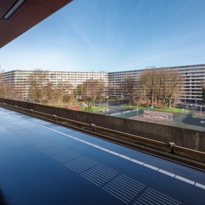
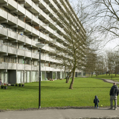
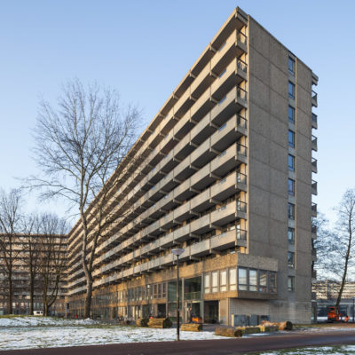
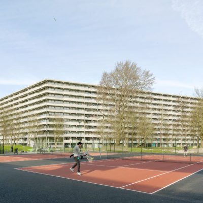
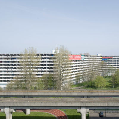
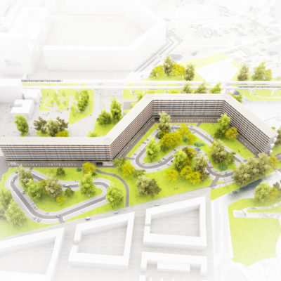
Kleiburg is located in the Bijlmermeer, a CIAM inspired residential expansion of Amsterdam designed in the sixties by Siegfried Nassuth of the city planning department. De Bijlmer was intended as a green, light and spacious alternative for the -at that time- disintegrating inner city. The Bijlmer was designed as a single project. A composition of slabs based on a hexagonal grid. An attempt to create a vertical garden city. Traffic modalities were radically separated; cars on elevated roads and bicycles and pedestrians on ground level. They would no longer share the same space. Now the area houses about 100,000 people of over 150 nationalities. The Bijlmermeer had a very optimistic start. But soon the enthusiasm for this radical residential area was overshadowed by fear-for-the-unknown. Fed by heavily economized execution, bad publicity, lack of understanding, poor maintenance and the sudden emergence of a new residential dream type -the suburban home- the Bijlmer turned into a slowly disintegrating parallel universe. A renewal operation started in the mid nineties. The characteristic honeycomb slabs were replaced by mostly suburban substance, by ‘normality’. However it was decided to keep the most emblematic area intact -flanking the stunning, for-ever-futuristic elevated subway line. The so-called Bijlmer Museum came into being; a compact refuge for Bijlmer Believers. Kleiburg is the cornerstone of the remaining ensemble.

WHAT - Program


TOTAL CONSERVATION / CONTINUITY: The functional program remains the original one.

DESCRIPTION:
Kleiburg is the last building in the area still in its original state; in a way it is the “last man standing in the war on modernism”. Housing Corporation Rochdale, however, had plans to demolish it. They calculated that a thorough renovation would cost about 70 million Euro... But bulldozing the masterpiece by architect Fop Ottenhof would lead to a collapse of the magnificent urban composition. In anticipation to the fierce resistance by ‘believers’ and pressure by the local government, that hoped to avert demolition, Rochdale launched a campaign to rescue the building: Kleiburg was offered for ONE EURO in an attempt to catalyze alternative, economically viable plans. Over 50 parties responded with a range of ideas from student or elderly housing to woon/werk-units, or homes for the homeless.

WHO - Financing


TOTAL CONSERVATION / CONTINUITY: The investor is the property owner.

DESCRIPTION:
Consortium De Flat: KondorWessels Vastgoed, Hendriks CPO, Vireo Vastgoed, Hollands Licht / Martijn Blom. Four teams were selected to further develop their ideas. Ultimately Consortium De FLAT consisting of KondorWessels Vastgoed, Hendriks CPO, Vireo Vastgoed and Hollands Licht, was chosen with their proposal to turn Kleiburg into a Klusflat. ‘Klussen’ translates as to do it yourself.

HOW MUCH - Absolute Dimensions

- SURFACE present NO VARIATION,

TOTAL CONSERVATION / CONTINUITY: The overall dimensions are equal to the pre-existing surface.

- VOLUME present NO VARIATION,

TOTAL CONSERVATION / CONTINUITY: The overall dimensions are equal to the pre-existing volume.

DESCRIPTION:
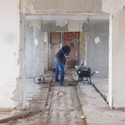
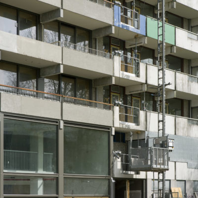
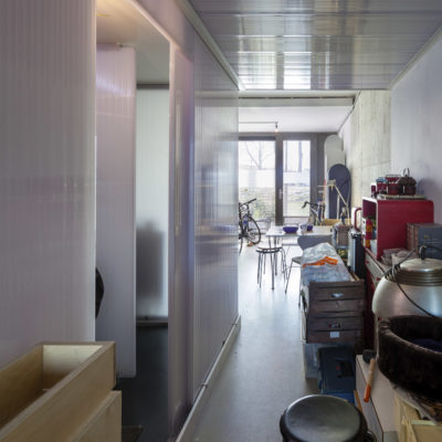
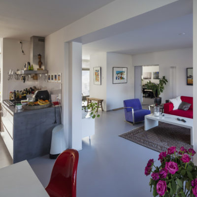
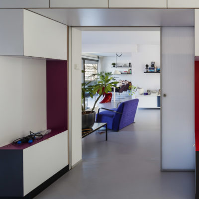
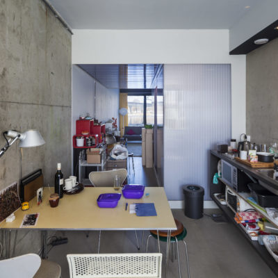
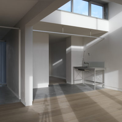
The idea was to renovate the main structure -elevators, galleries, installations- but to leave the apartments unfinished and unfurnished: no kitchen, no shower, no heating, no rooms. This would minimize the initial investments and as such created a new business model for housing in the Netherlands. The ambition was to open up new ways to live, to offer new typologies by combining two flats (or even more!) into one, by making vertical and horizontal connections. The future residents could buy the shell for an extremely low price and then renovate it entirely according to their own wishes: DIY. Owning an ideal home suddenly came within reach…

HOW MUCH - Relative Dimensions


TOTAL CONSERVATION / CONTINUITY: There are no new spaces.

DESCRIPTION:
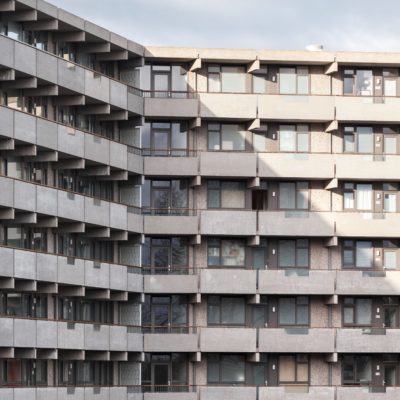
By many, repetition was perceived as evil. Most attempts to renovate residential slabs in the Bijlmer had focused on differentiation, the objective, presumably, to get rid of the uniformity, to ‘humanize’ the architecture. But after two decades of individualization, fragmentation, atomization it seemed an attractive idea to actually strengthen unity: Revamp the Whole! It became time to embrace what is already there: to reveal and emphasize the intrinsic beauty, to Sublimize!

HOW - Design Strategy STRUCTURE


PREVALENT CONSERVATION / CONTINUITY: The supporting structure is mainly the original one.

DESCRIPTION:
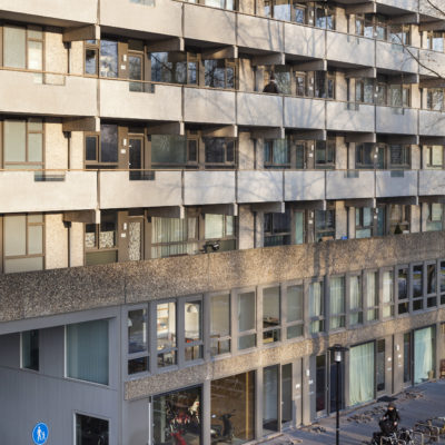
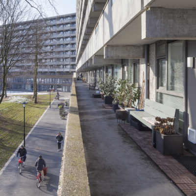
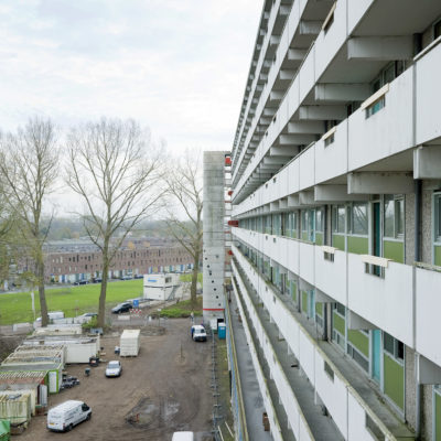
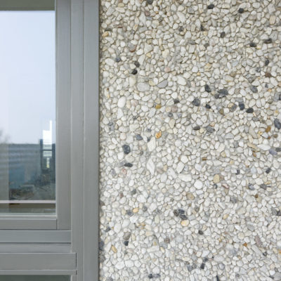
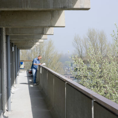
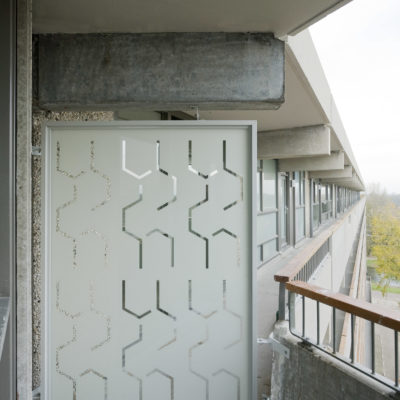
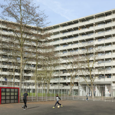
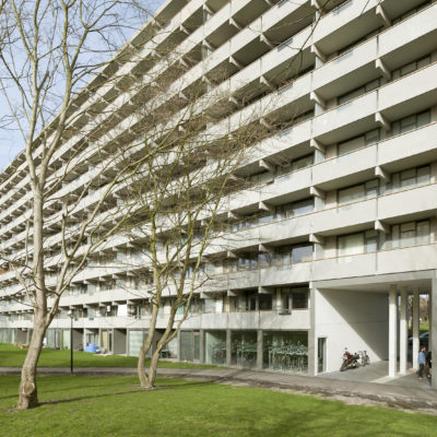
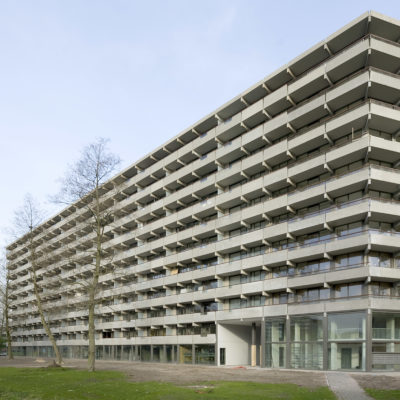
In the eighties three shafts had been added on the outside featuring extra elevators: although they look ‘original’ they don’t belong there, they introduce disruptive verticality. But it turned out that these concrete additions could be removed. There was still enough space in the existing shafts; new elevators could actually be placed inside the existing cores. And the brutal beauty of the horizontal balusters could be restored! Sandblasting the painted balusters revealed the sensational softness of the pre-cast concrete: better than travertine!

HOW - Design Strategy MATERIAL


BALANCE BETWEEN CONSERVATION AND REPLACEMENT: The materials chosen for the new intervention balance similarities and differences with the existing ones.

DESCRIPTION:
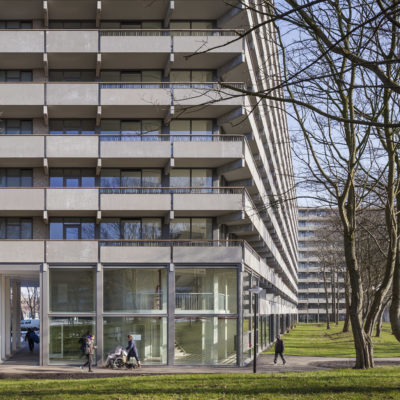
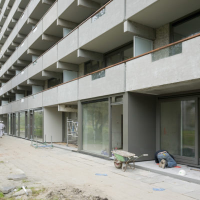
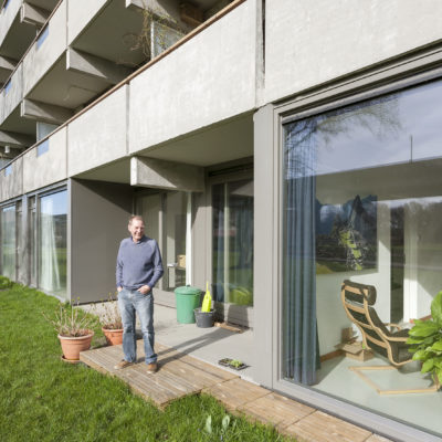
Originally the storage spaces for all the units were located on ground floor creating an impenetrable area, a ‘dead zone’ at the foot of the building. By relocating the storerooms to the upper levels near the elevators the ground level could be freed up for more interactive forms of inhabitation: apartments, workspaces, daycare. As such the plinth would be activated: a social base embedded in the park. In addition a catalogue of facade modules was created from which the future inhabitants could choose a set of window frames that would match the customized layout of their FLATs: openable parts, sliding doors, double doors, a set-back that creates space for plants or people. As such a personal ‘interface’ could come into being that could activate the galleries. Gallery illumination has a tendency to be very dominant in the perception of this type of single loaded apartment buildings. The intensity of the lamps that light up the front doors on the open-air corridors overrules the glow of the individual units. The warm ‘bernstein’ radiance of the apartments is obscured behind by a screen of cold lights. What if all gallery lights worked with energy saving motion detectors? Every passer-by a shooting star!
HOW - Design Strategy IMAGE


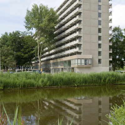
TOTAL CONSERVATION / CONTINUITY: The new intervention is in total mimetic continuity with the existing structures.

DESCRIPTION:
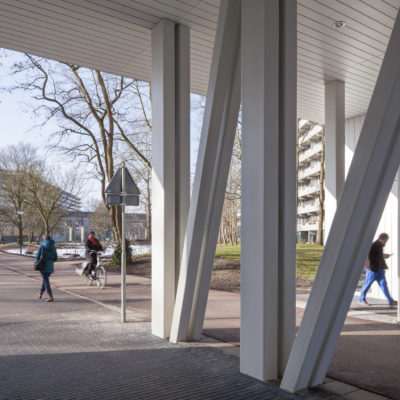
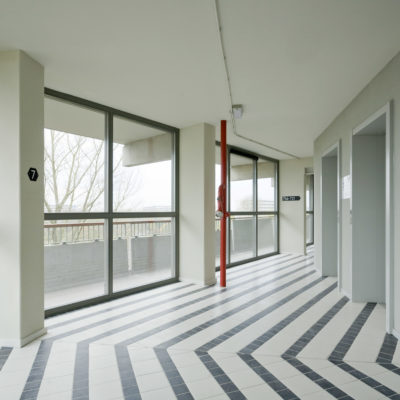
The interior street that served as the connector between parking garages and elevator cores was a fundamental ingredient of the Bijlmer. It was located on the first floor at plus three meters and forced the underpasses to become low. And unpleasant. But since lowering the elevated roads was one of the central ideas of the renewal of the area the inner street became obsolete. Now larger openings could be created connecting both sides of the building in a more scenic and generous way. On the galleries the division between inside and outside was rather defensive: closed, not very welcoming. There was room for improvement. The opaque parts of the facade were replaced with double glass. By opening-up, the facade becomes a personal carrier of the identity (even with curtains closed).