WHAT

WHO

HOW MUCH

HOW

PROGRAM
FINANCING
ABSOLUTE DIMENSIONS
RELATIVE DIMENSIONS
DESIGN STRATEGY

SURFACE EXTENSION

SURFACE REDUCTION

VOLUME EXTENSION

VOLUME REDUCTION

STRUCTURE

MATERIAL

IMAGE

84 PROJECTS

Variation of modes of use: functions, users, schedules, etc.

Relationship between the ownership and the form of the investment that allows the transformation

Variation of the overall dimensions of the building

Proportional relationship between new spaces and existing spaces

Relationship between the structural adjustments and the existing structure

Relationship between the forms and types of pre-existing materials and those of the new intervention

Relationship between the image of the new and the image of the existing (mimesis / contrast)

LOCATION

Klagenfurt (Carinthia, Austria)

ARCHITECTS / FIRM

Frediani-Gasser Architettura ZTgmH

YEAR

2019

Gianluca Frediani – Haus der Technik


PROJECT - Main Infos

PROJECT: Gianluca Frediani – Haus der Technik

LOCATION: Klagenfurt (Carinthia, Austria)

YEAR: 2019

ARCHITECT / FIRM: Frediani-Gasser Architettura ZTgmH

BUYER: Landeshauptstadt Klagenfurt (City of Klagenfurt, public)

SURFACE: 2.500 sqm

PRICE: € 3.750.000

DESCRIPTION:
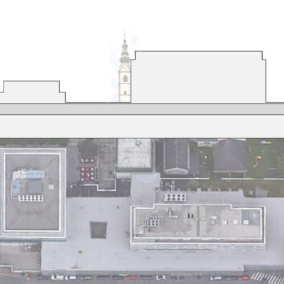
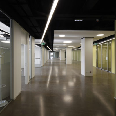
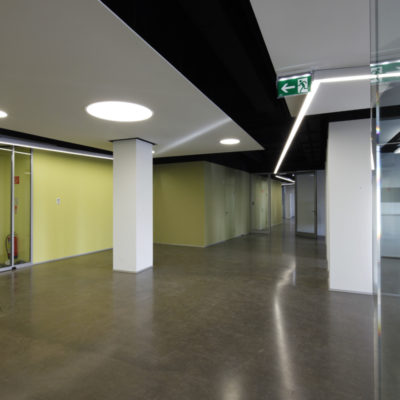
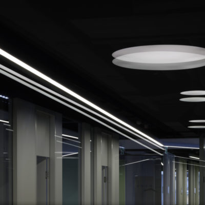
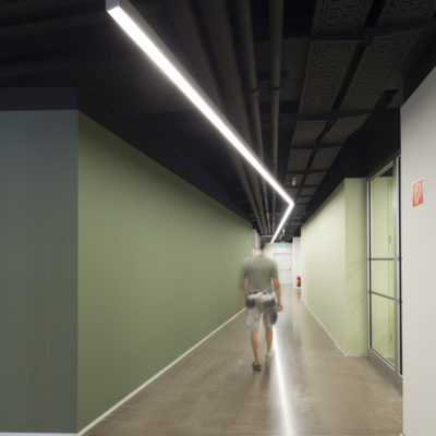
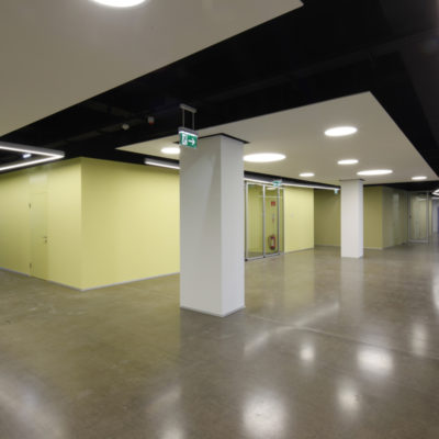
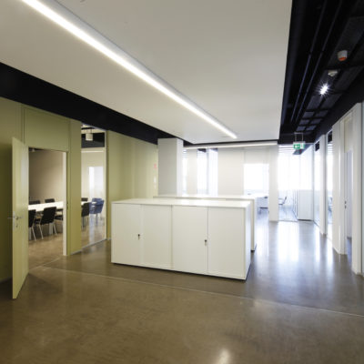
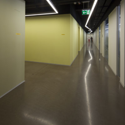
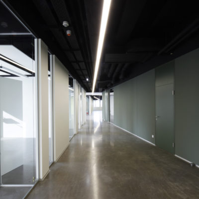
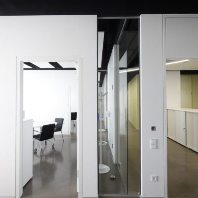
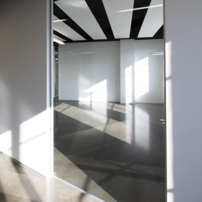
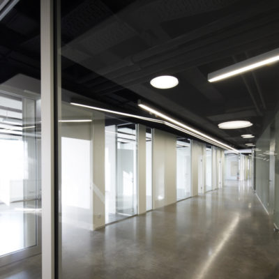
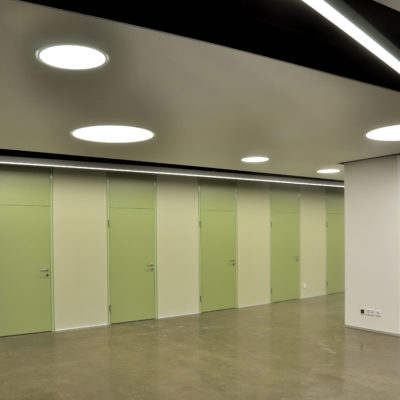
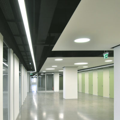
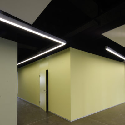
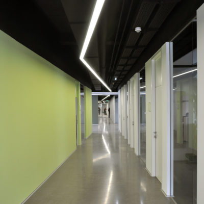
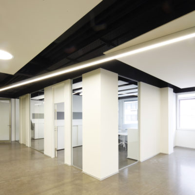
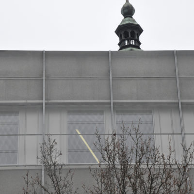
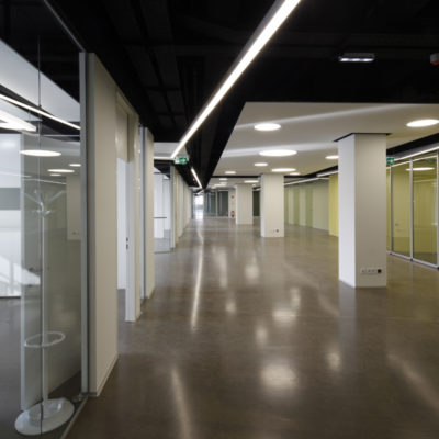
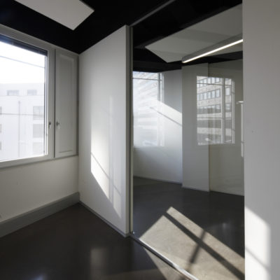
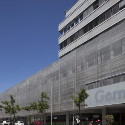
Complete redevelopment of a shopping center (Gerngross) as the new headquarters for the technical departments of the city of Klagenfurt (Carinthia, Austria). The building is located in the old center of the city, next to the St. Peter and Paul Cathedral (XVI century). It was built in the late 1970s, with a brutalist and together eclectic style, to complete the reconstruction after the Second World War of the hard bombed and almost completely destroyed urban block. The actual shopping centre is composed of a three-storey massive body with a five-storey tower above and two levels of underground parking. The redevelopment covers an entire floor of the complex, which has been emptied and wholly transformed inside. The space hierarchy, with functional blocks and connecting zone, reproduces in a small scale an urban fabric with paths and public areas. Color and transparency have been conceived for an easy orientation of people, also guided by the network of luminous segments hanging from the ceiling. In some places, these lights can be also seen outside from the street. Exposed radiant panels ensure heating/cooling of offices and workspaces with the achievement of passive building standards. A new patio allows efficient cross ventilation and, at the same time, opens glimpses onto the nearby Cathedral. The project was conceived and implemented as the first transformation phase of the old shopping center that the city has been over time acquired. The second phase, with the public entrance and the new gallery to the Cathedral, is currently being designed.
WHAT - Program


PREVALENT REPLACEMENT / DISCONTINUITY: The functional program is predominantly a new program.

DESCRIPTION:
The transformation program of the building complex has two dimensions and two categories of problems that are completely different and almost separate from one another. The urban dimension concerns the opening of material and visual connections with the Cathedral that represents the main urban element. The internal dimension, instead, has to do with a low-quality building reduced to a pure skeleton to be completely remodeled. In the first case, we have opened perspectives that cross the whole building, to get new views towards the Cathedral and we have studied public connections for the ground floor. In the second case, instead, we have concentrated our attention on the design of transparent workspaces, connected with the collective elements through a pseudo-urban system. The transformation also includes the complete energy and environmental renovation of the building.

WHO - Financing


TOTAL REPLACEMENT / DISCONTINUITY: Financing made entirely by an investor other than property.

DESCRIPTION:
The complete works financing was supported by the city of Klagenfurt, which acquired the entire building over time. This slow acquisition has been a further problem for the project, since we had not only to transform the available spaces, but to have already in mind a much wider project for the requalification involving the whole building complex and above all the entire urban block. Construction costs have respected the amounts provided for. The second phase of works is currently being planned.

HOW MUCH - Absolute Dimensions

- SURFACE present NO VARIATION,

TOTAL CONSERVATION / CONTINUITY: The overall dimensions are equal to the pre-existing surface.

- VOLUME present NO VARIATION,

TOTAL CONSERVATION / CONTINUITY: The overall dimensions are equal to the pre-existing volume.

DESCRIPTION:
The project does not foresee changes in the volume of the existing building. The only change was the opening of the patio on the third floor in order to obtain better lighting and ventilation of the massive building. The layout of the roofs and facades will be addressed in the last phase of the work.

HOW MUCH - Relative Dimensions


TOTAL CONSERVATION / CONTINUITY: There are no new spaces.

DESCRIPTION:
The project does not foresee changes in the surfaces of the existing building. The arrangement of the ground floor with the covered public connections to the square and the Cathedral are currently being planned.

HOW - Design Strategy STRUCTURE


TOTAL CONSERVATION / CONTINUITY: The original supporting structure is fully preserved and there are no new structures.

DESCRIPTION:
The structure of the existing building is the only part that has remained unchanged. Its rather slim sizing has forced to realize, where possible, a lightening of the working loads.

HOW - Design Strategy MATERIAL


TOTAL CONSERVATION / CONTINUITY: The materials chosen for the new intervention are similar to the pre-existing ones.

DESCRIPTION:
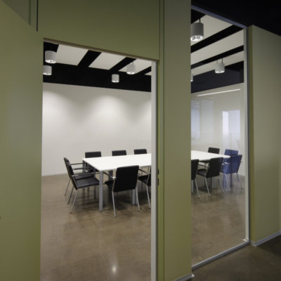
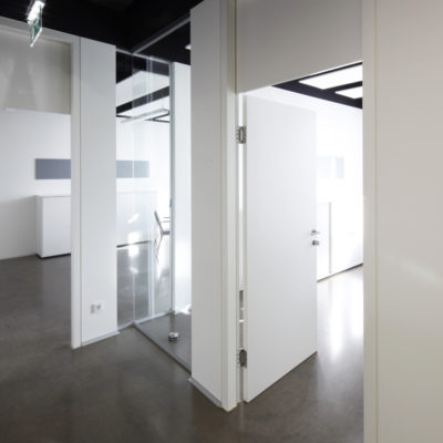
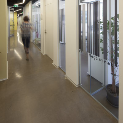
The project includes simple, durable and inexpensive materials. The floor was made with a special smoothed cement, colored in paste. The windows are in white painted wood. Color and transparency of the glass are the almost unique materials characterizing the internal surfaces of the workspaces and of the public areas.

HOW - Design Strategy IMAGE


TOTAL CONSERVATION / CONTINUITY: The new intervention is in total mimetic continuity with the existing structures.

DESCRIPTION:
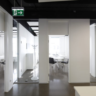
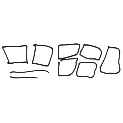
The new spatial configuration is based on a model recalling a historical urban fabric. The offices are positioned along the perimeter and overlook, almost like urban facades, on public routes. The collective or common functions are grouped in internal areas, irregularly cut by the distribution. In some special points we have left some gaps so that it is possible to look across the building from one side to the other and to grasp significant elements of the urban landscape. These visual glimpses can sometimes be also seen from the street, underlined by the presence of the luminous lines at the ceiling.