WHAT

WHO

HOW MUCH

HOW

PROGRAM
FINANCING
ABSOLUTE DIMENSIONS
RELATIVE DIMENSIONS
DESIGN STRATEGY

SURFACE EXTENSION

SURFACE REDUCTION

VOLUME EXTENSION

VOLUME REDUCTION

STRUCTURE

MATERIAL

IMAGE

84 PROJECTS

Variation of modes of use: functions, users, schedules, etc.

Relationship between the ownership and the form of the investment that allows the transformation

Variation of the overall dimensions of the building

Proportional relationship between new spaces and existing spaces

Relationship between the structural adjustments and the existing structure

Relationship between the forms and types of pre-existing materials and those of the new intervention

Relationship between the image of the new and the image of the existing (mimesis / contrast)

LOCATION

92, Corso Ruggero, Cefalù (Palermo), Italy [38° 02’ 18’’ N – 14° 01’ 19’’ E]

ARCHITECTS / FIRM

Marcello Panzarella

YEAR

1984

Marcello Panzarella – Corte delle Stelle


PROJECT - Main Infos

PROJECT: Marcello Panzarella – Corte delle Stelle

LOCATION: 92, Corso Ruggero, Cefalù (Palermo), Italy [38° 02’ 18’’ N – 14° 01’ 19’’ E]

YEAR: 1984

ARCHITECT / FIRM: Marcello Panzarella

BUYER: Municipality of Cefalù (Palermo)

SURFACE: 630.00 sqm

PRICE: € 1.000.000

DESCRIPTION:
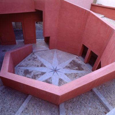
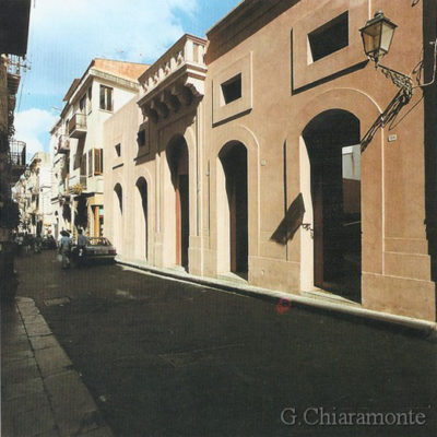
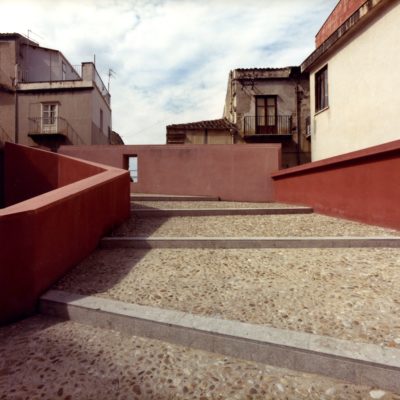
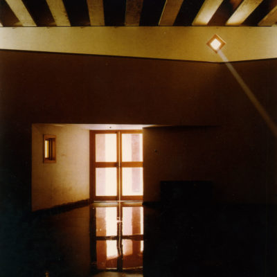
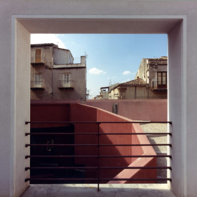
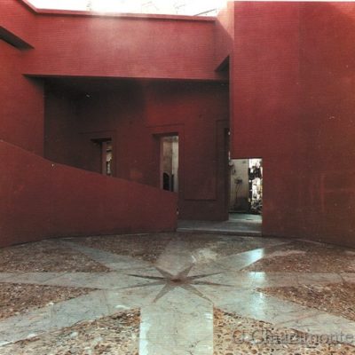
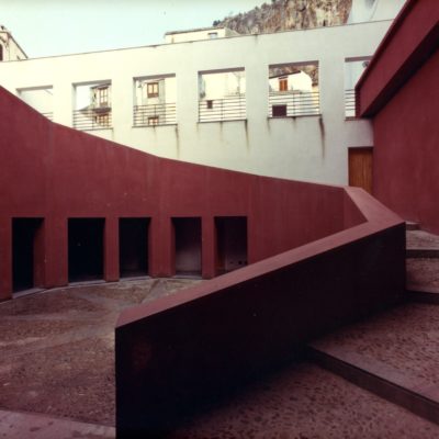
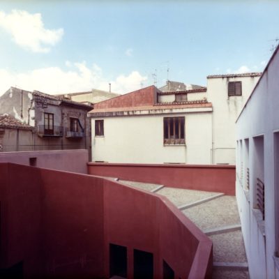
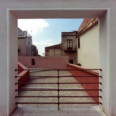
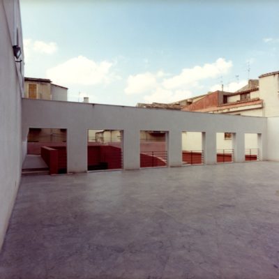
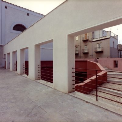
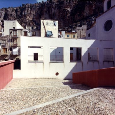
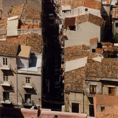
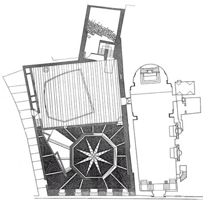
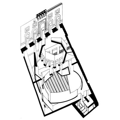
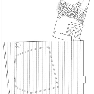
In the historic centre of Cefalù, dominated by a huge cliff named “Rocca” and the imposing Norman cathedral, the current main street marks the limit between the Hippodamian plan, dating from Hellenistic times, and the medieval urban fabric, settled on the first slopes of the cliff. Located along this road, the intervention brought new life and use to the historic ruins of an ancient hospital, in one direction conforming to certain rules of the settlement, and on the other tending to introduce a powerful element of invention. By maintaining the existing street lines, there have been created, on the interior of the lot, two contiguous "plazas", settled on two different levels, with a multiple function double-height hall, built under the upper plaza. By crossing the residual façade of the ruined former hospital, one continues along an ideal route from the sea toward the Rocca; this route finds its most powerful moment in the climb up the stairway, which – winding in a spiral around the central octagonal courtyard – links all the parts of the renovation, and lastly leads up the upper plaza. This has been conceived as a room open to the sky, laconic and mute. It is delimited by a wall with windows, which looks out over the lower courtyard and gives out upon the sea, in the far distance. The interior spaces of the multiple function hall rotate around a room with an oval plan, upon which a sort of gallery looks out, cut as a free cornice or frame, to be used for temporary exhibits. During the work underway, there was discovered, at an intermediate level, a noteworthy element of ancient urban fabric, with rooms and a street, dating back to the first century A.D. The find was maintained in situ, and there was the occasion for creating a perfectly operative and usable archaeological room, which required considerable modifications to the original plan.

WHAT - Program


TOTAL REPLACEMENT / DISCONTINUITY: The new functional program has completely replaced the original one.

DESCRIPTION:
The local Detailed Plan of the Historic Center required to preserve and partially reconstruct the remains of the collapsed building's facade, overlooking Corso Ruggero – the main street of the Historic Center of Cefalù - and the total renovation of the interior spaces. The collapsed building had been home to a hospital since the sixteenth century, while in the second half of the nineteenth century and the first decades of the twentieth century it had served as the seat of the Town Hall. The Plan required that in the interior spaces, after the removal of the ruins, a "piazza" be built on two levels, with an inner multi-purpose hall, storage, and toilets, and a small coffee bar, also accessible from via Costa, a street parallel to Corso Ruggero, running at a higher level, with a drop of about eight meters. Furthermore, a door should have been opened between the upper level of the multipurpose hall and the interior space of the adjacent church of the Santissima Annunziata, destined to become an auditorium. The discovery of an archaeological find, a very large stretch of an urban street and rooms dating from the 1st century AD, forced a considerable change to a part of the program. It was necessary to renounce digging beneath the find, modify the structural design, find a different location for the toilets, reduce their size, and above all create an archaeological hall in order to adequately contain the find, and make it fully accessible to visitors.

WHO - Financing


TOTAL CONSERVATION / CONTINUITY: The investor is the property owner.

DESCRIPTION:
Formerly, until 1866, the building had been a Church asset. A few years after the unification of Italy it was expropriated, due to the anti-clerical laws approved by the new Italian Parliament. Since then the building has been continuously owned by the Municipality of Cefalù. Between the end of the Nineteenth Century and the first decades of the Twentieth Century it was used as the Town Hall of Cefalù, but later it was abandoned for a long time, until - on April 17, 1964 - it collapsed, destroying a neighboring house. Twenty years later, after the Detailed Plan of the Historic Center came into force, the Mayor of Cefalù appointed the project responsibilities for the new intended use, in order to realize an architectural design program involving the construction of a multi-purpose facility, usable for conferences and seminars, concerts, theatrical performances.

HOW MUCH - Absolute Dimensions

- SURFACE present NO VARIATION,

TOTAL CONSERVATION / CONTINUITY: The overall dimensions are equal to the pre-existing surface.

- VOLUME present REDUCTION,

PREVALENT CONSERVATION / CONTINUITY: The overall dimensions decrease moderately with respect to the pre-existing volume.

DESCRIPTION:
Before its collapse, occurred in 1964, the building was three stories high, including the elevation of the ground floor. Its main door, and four other smaller adjacent doors, opened onto the main street of the town. As a whole, the pre-existing building was much taller and more voluminous than the present one, and reached almost the height of the adjacent church. The Detailed Plan of the Historic Centre required to recover the remaining part of that façade overlooking the main street. Its missing parts, especially those on the left side, were completed, starting from the ground floor up to the level of the first floor. All the doors have maintained their function. However, instead of leading directly to a covered interior space, they introduce an octagonal courtyard, open to the sky. A spiral staircase, also uncovered, winds around that octagonal space, leading to the upper terrace. Most of the volume of the new intervention is located under this terrace The rest of the volume is quite small; on one side it faces the terrace and on the other stands on the edge of the back street; it is two stories high and its original intended use was that of a coffee bar; actually it was used as a meeting place for older people.

HOW MUCH - Relative Dimensions


TOTAL REPLACEMENT / DISCONTINUITY: The new spaces have completely replaced the existing spaces.

DESCRIPTION:
The original volumes were totally replaced by the intervention. After the existing building collapsed, its ruins proved to be no longer usable nor accessible, due to their static instability. They remained propped up for about twenty years. In 1979, the Detailed Plan of the Historic Centre established that in their place a much less bulky building should arise, leaving the lot much more empty. At the same time the adjacent church, destined to become an auditorium, should have been connected to the new intervention, as an element of a single functional system. This could not be eventually achieved, due to bureaucratic obstacles.

HOW - Design Strategy STRUCTURE


PREVALENT REPLACEMENT / DISCONTINUITY: The supporting structure is predominantly a new structure.

DESCRIPTION:
The only parts of the ancient structures remaining in the new intervention are the stone wall of the front overlooking the main road, and the archaeological find, which had been buried for about 19 centuries. All new structures are in reinforced concrete. Even the wall of the ancient façade was anchored to an adjacent reinforced concrete support wall. The roof of the inner hall was built in a tight sequence of prestressed concrete double T beams and prefabricated reinforced concrete roofing elements. After the discovery of the archaeological find, it was necessary to modify the supporting structures originally designed for that area, in order to preserve as much as possible of the ancient urban fabric; consequently a different supporting system was created, based on a very thick belt of micropiles, with a beam connecting them at the top.

HOW - Design Strategy MATERIAL


BALANCE BETWEEN CONSERVATION AND REPLACEMENT: The materials chosen for the new intervention balance similarities and differences with the existing ones.

DESCRIPTION:
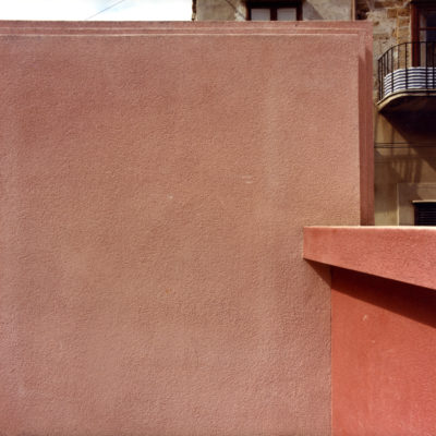
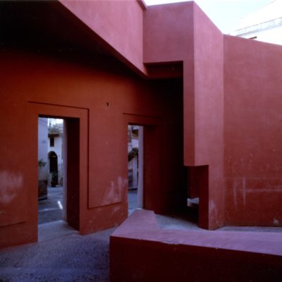
All the structures, both the load-bearing structures and the few partitions, were covered with plaster. The external plaster is raw, prepared and applied according to the traditional Palermo method, called "Livigni". The range of colors is decidedly warm, with a prevalence of Pompeian red in the octagonal courtyard. The internal plaster is a traditional "tonachina" based on lime, finished with white traditional stucco.

HOW - Design Strategy IMAGE


BALANCE BETWEEN CONSERVATION AND REPLACEMENT: The new intervention balances elements of continuity and discontinuity with respect to existing structures.

DESCRIPTION:
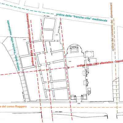
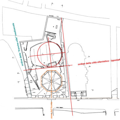
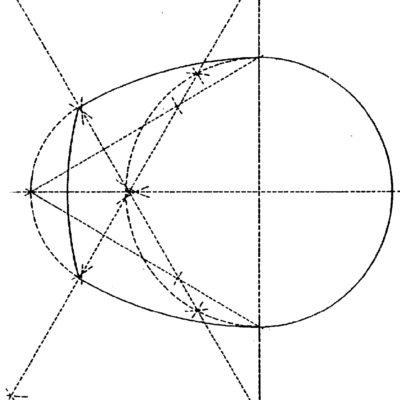
Although most of the intervention is completely new, the designer's intention was to balance these innovations by paying special attention to the relations with the surrounding urban fabric, the different directions of the streets, and the main principles of settlement that overlapped and interacted in that site during the time of two thousand four hundred years. Therefore, a part of the intervention is oriented according to the order of the ancient Hellenistic city, while other parts, adjacent to the medieval fabric, adapt to it along their external perimeter, with consequences also in the internal space. The contradictions between the various urban orders, compelled and driven to mutual interaction, generate strong spatial tensions. The architectural project takes advantage of those tensions to configure an always dynamic space. From this point of view, this work is also an exercise in the use of geometry as an instrument of architectural composition. It could be said that this intervention has no real facades, except for the remaining front of the pre-existing building, while its real image is all enclosed in the faceted envelope of its open-air space, and shows itself in the internal spatiality of the two-level covered hall, characterized by an ovoid shape, like a theater. Moreover, for some aspects it could also be argued that the apparent solidity of the masses is contradicted by the way they are treated, like cardboard sheets to be freely cut out in space. Finally, other figurative devices would suggest some connection or dependence on History. The eight-pointed floor star, and the helicoidal staircase, certainly refer to Italian Renaissance architecture; the view of the blue sky through the white windowed wall perhaps refers to the sky seen between the columns of the Parthenon, while the strong red colour of the courtyard recalls the colours of Crete and Pompeii.