WHAT

WHO

HOW MUCH

HOW

PROGRAM
FINANCING
ABSOLUTE DIMENSIONS
RELATIVE DIMENSIONS
DESIGN STRATEGY

SURFACE EXTENSION

SURFACE REDUCTION

VOLUME EXTENSION

VOLUME REDUCTION

STRUCTURE

MATERIAL

IMAGE

84 PROJECTS

Variation of modes of use: functions, users, schedules, etc.

Relationship between the ownership and the form of the investment that allows the transformation

Variation of the overall dimensions of the building

Proportional relationship between new spaces and existing spaces

Relationship between the structural adjustments and the existing structure

Relationship between the forms and types of pre-existing materials and those of the new intervention

Relationship between the image of the new and the image of the existing (mimesis / contrast)

LOCATION

Merano

ARCHITECTS / FIRM

Walter Angonese & Flaim Prünster Architekten Structural concept: Prof. Dr. Ing. Mario Monotti, Locarno CH Gastronomic concept: Klaus Maran (Seehotel Ambach + Gretl am See + Seehofkeller), Kaltern Project collaboration: Francesco Baggio

YEAR

2019

Francesco Flaim, Quirin Prünster con Walter Angonese – Grand Café & Restaurant Kurhaus, Merano


PROJECT - Main Infos

PROJECT: Francesco Flaim, Quirin Prünster con Walter Angonese – Grand Café & Restaurant Kurhaus, Merano

LOCATION: Merano

YEAR: 2019

ARCHITECT / FIRM: Walter Angonese & Flaim Prünster Architekten Structural concept: Prof. Dr. Ing. Mario Monotti, Locarno CH Gastronomic concept: Klaus Maran (Seehotel Ambach + Gretl am See + Seehofkeller), Kaltern Project collaboration: Francesco Baggio

BUYER: Ente Gestione Teatro e Kurhaus of Merano

SURFACE: 1.270 sqm

PRICE: € 1.650.000,00

DESCRIPTION:
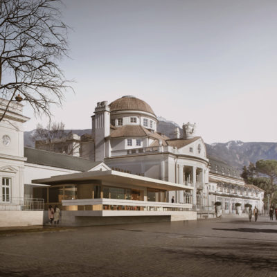
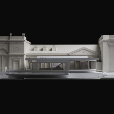
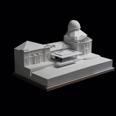
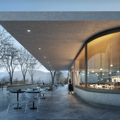
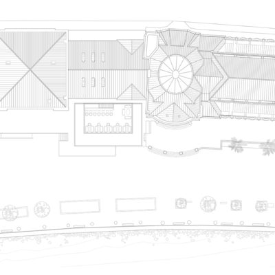
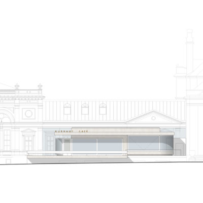
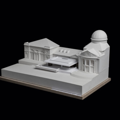
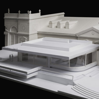
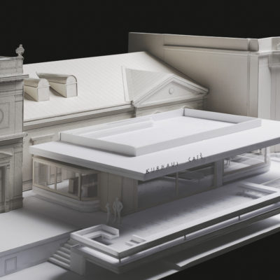
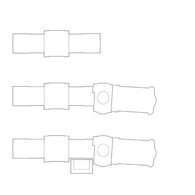
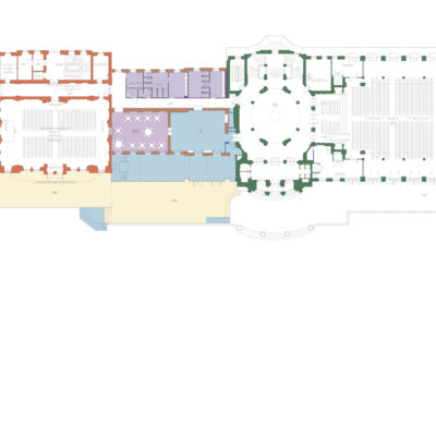
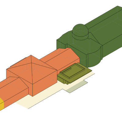
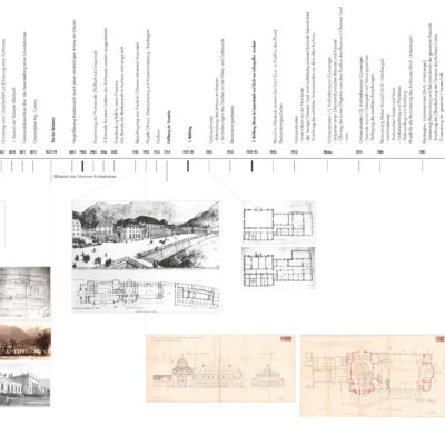
The building history of the Kurhaus - the origin of one of the most important buildings in South Tyrol of the 20th century and our approach of a ‘Weiterbauen’ (continued construction) - represent the basis of our project. The continued remodeling leading up to the final project and construction by Friedrich Ohmann show of his deeply rooted commitment to the Viennese Baroque. The liberty elements - as expected by the spirit of the time after 1900 - are applied and interwoven in the way of the semperian theory of dressing. But from a tectonic point of view the construction is rather contemporary, as the elements in reinforced concrete show. The different typologies - from the former baths, the premises of the royal-imperial cure administration (‘Kurverwaltung’), the Pavilion des Fleurs, the ‘Rotunde’ up to the grand concert hall (‘Kursaal’) - are threaded in the likes of a pearl necklace. This principle of adding also determined our project strategy. A reflected addin, an architectural positioning in the manner of Ohmann should represent the next episode. Not a formal, but a tectonic continuity in the construction! The last refurbishment had bet on the typology of the porch. which is probably never really wrong, but doesn’t represent the spirit of adding and interweaving. It’s being a compromise is manifested by the incapability of entering a dialogue with the Foyer, it remains a Veranda in front of an iconic building. This is only one of the reasons why chose an autonomous typology. An architectural space that can hold its one with the historical presence of the existing building. While the additive character of the building is evident on the front of the Corso della Libertà, a conceptual void on the side of the promenade fails to link the Pavillon des Fleurs to the Rotunde and the Kursaal. This section - corresponding to the Ohmann Hall and the rooms of the Café and Restaurant - lacks the necessary identity and weight to display the significance of the future and present use as a ‘Kurcafé’, the socializing and cultural spot par excellence. The new construction consists mainly of a white concrete slab, a roof that fills the aforementioned void on the terrace and gives a presence to the Grand Café, conceptually without ever touching the historic facade. A glass joint connects the two buildings for climatic and programmatic reasons. The facades are mostly glazed in order to achieve a fluid connection between interior and exterior space of the Café. The terrace protrudes on the promenade as if to provoke a more intensified relation between the two and works as a privileged point of view for its guests.

WHAT - Program


PREVALENT CONSERVATION / CONTINUITY: The functional program remains predominantly the original one, with a limited new program.

DESCRIPTION:
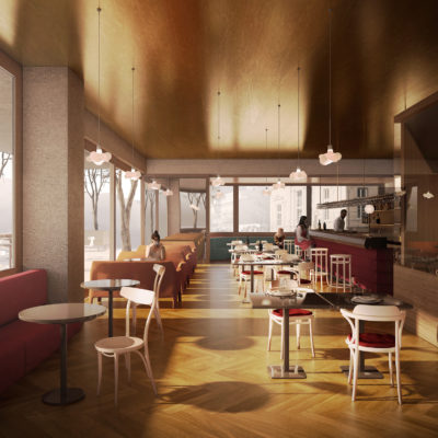
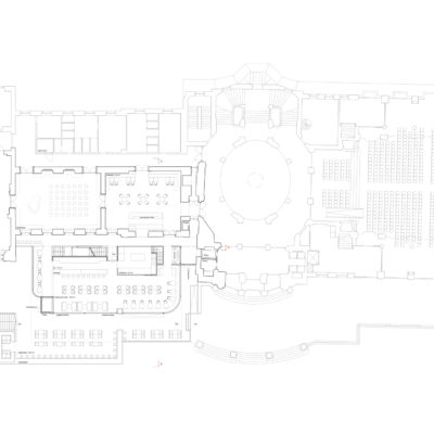
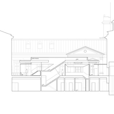
The desire of the client to realize a Viennese Café is interpreted by our project as the desire for a place to linger, where one can read, brood or converse. An approach that finds its connection to the Viennese Café probably more in the loosian spirit of craftsmanship and construction, as in the imitation of a typology that remains debatable in the 21th century, even considering the habsburgian character of Merano. In order to respect the specifics of the Viennese Café and to avoid a stereotypical gastronomy, a concept with a larger prep kitchen in the basement, that frees precious space on the ground floor, has been put into place. The interior of the Café and restaurant is organized around a long counter and the open show-kitchen with different seating situations. The massive construction and the adaption of the important tectonic element of the stairs as a load bearing structure, make the use of the roof terrace possible. Only a part of the roof is practicable, limited by the structural and tectonic concrete beam the occupancy remains in the ‘second row’. A use as panorama platform or secondary exterior surface can be considered. The existing Ohmann Hall and the neighboring room will be equipped with a bench running on the perimeter. This enables on one hand the use as rooms of the Café, on the other hand it serves as formal reinforcement of these ‘historic’ rooms, that have been reconstructed after their destruction during the Second World War.

WHO - Financing


TOTAL CONSERVATION / CONTINUITY: The investor is the property owner.

DESCRIPTION:
The Tourist Office Merano (Kurverwaltung) administers the building and promote its use with the realization of various events and concerts during the year. Founded in 1855, the Merano Tourist Office is the second-oldest health resort administration in Europe. While the building is a property of the city, the client is represented by the Kurhaus administration in the ranks of the Kurverwaltung. The gastronomic activity is rented out to restaurateurs over a long time period by means of a public announcement. Next to its regular function as Café and restaurant, it caters also to events such as the Merano Music Festival and the Wine Festival.

HOW MUCH - Absolute Dimensions

- SURFACE present EXTENSION,

PREVALENT CONSERVATION / CONTINUITY: The overall dimensions increase moderately with respect to the pre-existing surface.

- VOLUME present EXTENSION,

PREVALENT CONSERVATION / CONTINUITY: The overall dimensions increase moderately with respect to the pre-existing volume.

DESCRIPTION:
The new intervention increases the surface of the Café and restaurant slightly. The existing porch with its glazed roof is incongruent not only from a typological point of view, the climatic situation and the limited space for preparation of food and drinks are additional difficulties for an efficient activity. The decision to demolish the existing structure was taken by the client in advance to the competition brief. The size of the new volume although is not only dictated by the functional program, the cantilevered structure links the important building masses of the Pavillon des Fleurs and the Rotunde.

HOW MUCH - Relative Dimensions


PREVALENT CONSERVATION / CONTINUITY: Pre-existing spaces are prevalent with respect to new spaces.

DESCRIPTION:
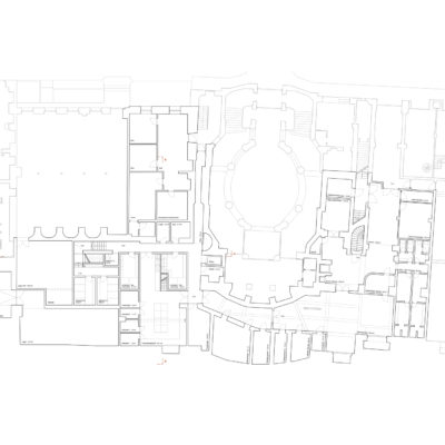
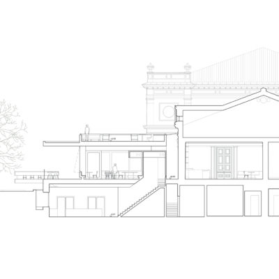
The Café and Restaurant occupy only the smaller part of the surface treated in the project. In the basement - ground floor from the Corso della Libertà - are situated the prep kitchen and staff rooms of the upstairs Cafe. A new elevator also provides access to the downstairs lavatories. The basement also hosts a large kitchen that is used for events that offer dining or need independent catering. This area - including changing rooms and storage - will be refurbished and reorganized. The Kurhaus building as a whole has undergone relatively recent and thorough refurbishment, during which large parts of it were rebuilt in a historicist, formal manner.

HOW - Design Strategy STRUCTURE


PREVALENT REPLACEMENT / DISCONTINUITY: The supporting structure is predominantly a new structure.

DESCRIPTION:
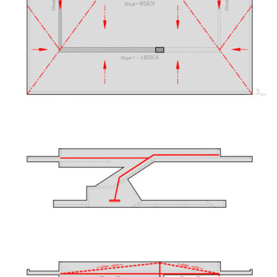
One of the most noble gestures of the structure is to deny itself, to lift itself from the ground as a sign of respect towards the neighboring building. Especially if the building is of considerable historic value and importance. The space of the new Kurcafé is limited to a cantilevered, rectangular slab that seems to rest only on one big pillar on the main facade. In order to discover the balance of the structure one must go on the roof and discover the solid connection between the roof and the massive parapet. The analysis of the forces confirms the slightly asymmetric position of the parapet/beams which are able to make positive use of the bending stress and deformation. The bigger part of the load is absorbed by the parapet, a smaller part by the beams on the short side and the side facing the glass joint. Once this system is clear, one can describe the force diagram on the ground floor where the asymmetric position of the big pillar on the main facade is completed by the position of a tension rod that substitutes a second pillar. Along the existing facade the structure works as a frame, once the stability of the parapet is guaranteed in one direction the beams in the other direction don’t need any further support and work as a secondary structural level for the roof. The horizontal loads are contrasted mostly together with the vertical loads by the large central pillar. The eccentricity of the loads and the torsional vibrations are contrasted by the oblique parapet of the stairs, which form counteracts every form of movement with its rigidity.

HOW - Design Strategy MATERIAL


BALANCE BETWEEN CONSERVATION AND REPLACEMENT: The materials chosen for the new intervention balance similarities and differences with the existing ones.

DESCRIPTION:
All building elements with tectonic relevance are executed in white, high quality exposed concrete as a reaction to the ornament of the historic building. The wood elements, in the spirit of Loos and the culture of Viennese cafes, shall be carried out in oiled mahagoni. The dark wood flooring complies to hat reflection. The flooring of the terrace is executed by continuing the existing stone pavement. The roof of the Café is treated with a gold painting from which illuminating elements are hung. Tables, benches and chairs are adequate reinterpretations of the culture of Viennese Cafés.

HOW - Design Strategy IMAGE


TOTAL CONSERVATION / CONTINUITY: The new intervention is in total mimetic continuity with the existing structures.

DESCRIPTION:
The project applies the concept of ‘Weiterbauen’ (continued construction) in tectonic and architectonic way. A formal continuity between the next episode of the history of the Kurhaus building and its heavily restored historicist image would not respect the design strategy of adding and interweaving. Rather than displaying a formal link to the existing building in its actual form, the project is deeply connected with the design strategy of the architect Friedrich Ohmann, whose project determined the Kurhaus as it is now, and his contemporaries in (and outside of) the Viennese school.