WHAT

WHO

HOW MUCH

HOW

PROGRAM
FINANCING
ABSOLUTE DIMENSIONS
RELATIVE DIMENSIONS
DESIGN STRATEGY

SURFACE EXTENSION

SURFACE REDUCTION

VOLUME EXTENSION

VOLUME REDUCTION

STRUCTURE

MATERIAL

IMAGE

84 PROJECTS

Variation of modes of use: functions, users, schedules, etc.

Relationship between the ownership and the form of the investment that allows the transformation

Variation of the overall dimensions of the building

Proportional relationship between new spaces and existing spaces

Relationship between the structural adjustments and the existing structure

Relationship between the forms and types of pre-existing materials and those of the new intervention

Relationship between the image of the new and the image of the existing (mimesis / contrast)

LOCATION

San Fernando de Henares, Madrid, Spain

ARCHITECTS / FIRM

Juan Carlos Sancho + Sol Madridejos

YEAR

1999

Juan Carlos Sancho + Sol Madridejos – Town Hall and Civic Centre in San Fernando de Henares


PROJECT - Main Infos

PROJECT: Juan Carlos Sancho + Sol Madridejos – Town Hall and Civic Centre in San Fernando de Henares

LOCATION: San Fernando de Henares, Madrid, Spain

YEAR: 1999

ARCHITECT / FIRM: Juan Carlos Sancho + Sol Madridejos

BUYER: Council of San Fernando de Henares

SURFACE: 6.500 sqm

PRICE: € 3.3188.354

DESCRIPTION:
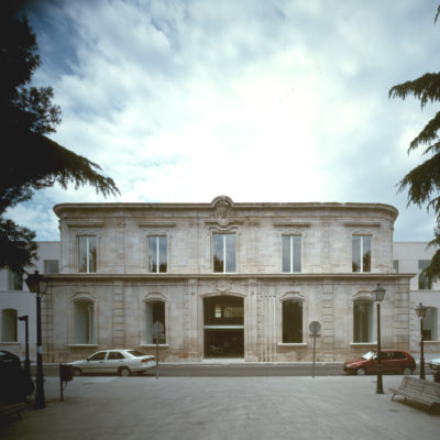
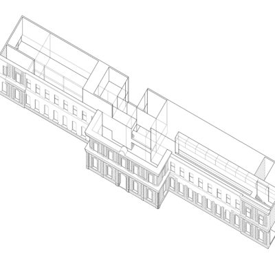
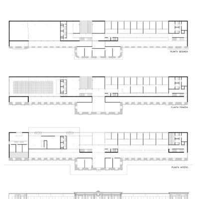
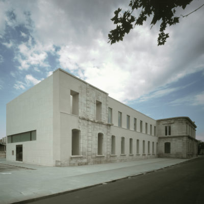
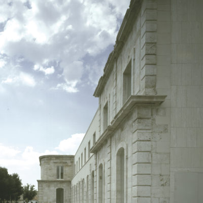
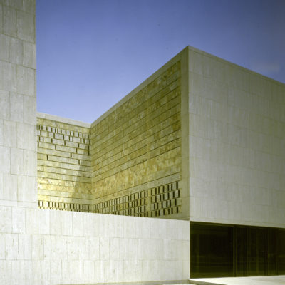
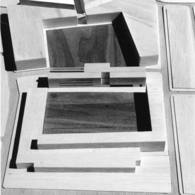
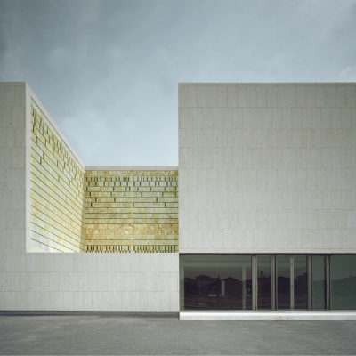
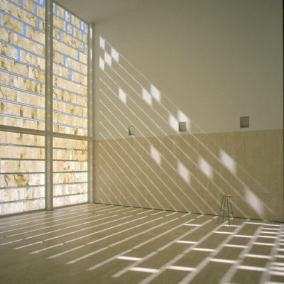
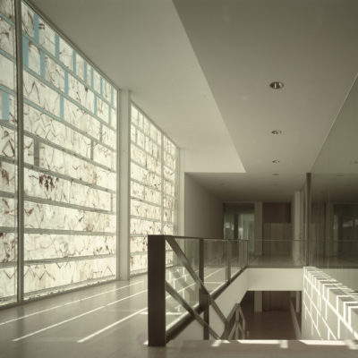
The building of the town and civic centre of San Fernando de Henares stands in the plot where the Royal Factory of Tapestries used to be. The factory was founded in 1746 by the king Fernando VII and it is attributed to the architect Pedro de Ribera. As a part of the baroque layout of the city, the main facade is the backdrop of the rest of public facilities of San Fernando. The factory would face a large square surrounded by the residential dwellings where the workers lived. Only few elements of the main facade remained preserved by the time the project began, so it looked as an exempt limestone plane. The rest of the block, originally occupied by the factory, was in real poor condition and had been filled by warehouses and landfills, giving the image of a degraded an unsafe area within the city centre. The project pursues a double goal: revitalizing a degenerated urban area and preserving and consolidating the existing ruins by incorporating them to the new building. The proposed prismatic volume equal in length as the historical facade (120 meters) coincides with the first centre line of the Royal Factory of Tapestries. This piece sits between two squares: the historical one that belongs to the baroque layout and the recently created one that completes the footprint of the new building. Both of them stand out from the compact mass of residential buildings. The new building is stone-hard volume perforated by the action of spatial projections. The focus is on the management, control, definition and perception of the spaces accompanying these operations. The opportunity presented by the brief to develop a 18m bay box along the powerful, silent remains of a mid XVIII century facade produced a play of juxtapositions: a linear facade against a solid volume, a symmetrical axis opposed to a rupture of symmetries, a vectorial rhythm opposed to projected spaces. The volume arises from the historical remains and integrates them in a neutral canvas with the rhythm and the geometry of the old facade. The organisation of this facade into two symmetrical wings with a central unifying body is taken up again in the project. This divides the proposed programme into two clearly differentiated parts: on one hand, in the north wing we find the Town Council chambers, while the south wing holds the Civic Centre and Public Areas. Hence the two spatial scales: the freer public spaces with independent units of their own, and the vertical organisation of the horizontal spaces in the Councils offices. The public zone is influenced by horizontal and vertical spatial projections that arise an 8x8x8 void in the volume. These stony void breaches its opacity, made translucent by onyx that is used as tectonic material. The void is tensed tangentially with the internal horizontal space of the Civic Centre that is projected towards the new square. The whole grid of spatial episodes works in continuity and is legible from the itinerary that threads them together.

WHAT - Program


TOTAL REPLACEMENT / DISCONTINUITY: The new functional program has completely replaced the original one.

DESCRIPTION:
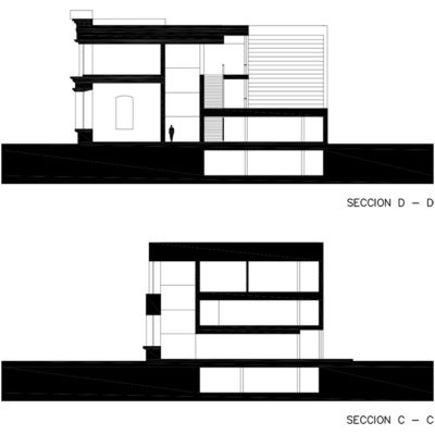
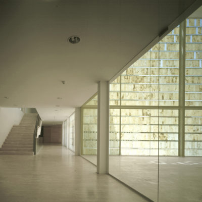
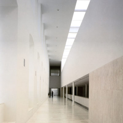
The new building is intended to be the town hall and civic centre of San Fernando de Henares. The access to the town hall follows the direction of the main facade from the historical square. There is also a continuity from the modern square towards the new spaces of the civic centre, through a decentralized access that breaks with the symmetry and strengthens the differentiated characters of both facades. A new volume of white travertine is proposed next to the historical facade. This volume leaves a vacant, longitudinal free height space which is in touch with the historical facade. This space allows to fully understand the main facade from inside and generates a circulation path and a public area between the new construction and the historical ruins. All the functions in the buildings are located along the longitudinal axis which is parallel to the facade. They are distributed in the following way: -The town hall in the northern wing is divided into three levels: administrative in the ground floor, technical in the first floor and political in the second floor. -The civic centre is placed in the southern wing, in the 8x8x8 meters volume. A series of related spaces is generated once the petrous volume is hollowed. These spaces are enhanced by the stony and translucent void. This wing also contains the Reception Hall, Council Session Room, Exhibition Room, Coffee Shop and Waiting area. The continuity of spaces can be read from the path. The main circulation ties them vertically, even though they are characterized by their scale, light and materiality.

WHO - Financing


PREVALENT REPLACEMENT / DISCONTINUITY: Financing for a minor part made by the original owner, mostly from another investor.

DESCRIPTION:
The building belongs to the council of San Fernando de Henares, where the headquarters and departments are based. The site and historical remainings are part of the Architectural Heritage of the Community of Madrid, which, together with the city council, is promoting its recovery and revaluation. The Autonomic Community of Madrid has set up a restricted architectural contest for the enhancement of the site and the construction of a new town hall. The council of San Fernando de Henares manages the construction project thanks to the financial support from the Community of Madrid. As the winners of the contest, Juan Carlos Sancho and Sol Madridejos are in charge of execution of the new building and the Masterplan. The construction of the square and residential buildings around will be accomplished after a few years according to the guidelines of the plan.

HOW MUCH - Absolute Dimensions

- SURFACE present EXTENSION,

TOTAL REPLACEMENT / DISCONTINUITY: The overall dimensions are more than four times the pre- existing surface.

- VOLUME present EXTENSION,

TOTAL REPLACEMENT / DISCONTINUITY: The overall dimensions are more than four times the pre- existing volume.

DESCRIPTION:
The building is fully new, since the main goal is to only reuse the remainings of the historical facade. The square proposed in the Masterplan reproduces the food print of the old factory.

HOW MUCH - Relative Dimensions


TOTAL REPLACEMENT / DISCONTINUITY: The new spaces have completely replaced the existing spaces.

DESCRIPTION:
The surface of the main facade (120 meters long) is the only one to be preserved. Thus, all the spaces are built from scratch.

HOW - Design Strategy STRUCTURE


PREVALENT REPLACEMENT / DISCONTINUITY: The supporting structure is predominantly a new structure.

DESCRIPTION:
The existing facade requires consolidation and structural reinforcement for its preservation. An exhaustive rehabilitation process is carried out, including the underpinning of foundations through a micropile screen. The new middle slabs step back from the old facade, except for the central body. A new steel structure is generated apart from the existing one. The roof top reaches the facade with a reduced structural load and a minimal impact support, so it is able to move independently.

HOW - Design Strategy MATERIAL


BALANCE BETWEEN CONSERVATION AND REPLACEMENT: The materials chosen for the new intervention balance similarities and differences with the existing ones.

DESCRIPTION:
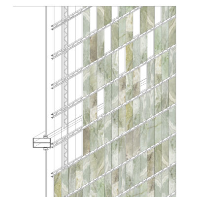
The use of stone as a traditional constructive material in this project arises from the need of restoring and completing the 18th century facade of the Royal Factory of Tapestries of San Fernando de Henares. Serious damages and stability issues were detected after examining the current state of the existing ruins. In order to preserve the old facade under the best possible conditions, several procedures have been undertaken to ensure technical and aesthetical aspects of the project: cleaning the facade, lifting the hanging arches, securing the cornices with tie beams… Colmenar limestone (same as the one used in the original building) with masonry sealed joints has been used for this purpose in mostly all the facade. The compact volume that embraces the old facade is defined by a ventilated facade of travertine pieces with a honed finish. The steretomic volume is opposed to the lineal historical facade and contains a whole scheme of spatial episodes that provides continuity as it is read from the path that bonds them. The public area is conditioned by the horizontal and vertical spatial projections that appear around the void. The opacity of the void is interrupted by onyx pieces of 40x10x0’8 centimeters with a double perception: rough and stony (saw cut) from outside and translucent and vitreous (polished) from inside. The joints between pieces are made by sikabond-tz polyurethane adhesive and sustained by poutrefil de bakaert beams of 6 centimeters.

HOW - Design Strategy IMAGE


PREVALENT CONSERVATION / CONTINUITY: The new intervention favors a relationship of continuity with the existing structures.

DESCRIPTION:
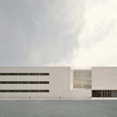
The image of the building is based on the will of harnessing the historical facade, making it explicitly different from the new opposite one. The urban strategy draws from placing the building as the hinge between two different squares: the old and the recently created one. This approach is also reflected in the appearance of the building itself, as it also confronts two main facades that face each of the squares. The prismatic volume made of white travertine is pierced in order to create a stony void that becomes a singular element towards the new square. This onyx hollow displays the petrous character of the volume and allows to control the light and to qualify the main public spaces inside at the same time.